
The Quentessa
2015
the assignment >
Turning a Brand Persona into a Physical World
As part of a national repositioning, Qdoba developed The Quentessa — a fictional persona created to embody the brand’s personality, attitude and point of view.
Working through CIG Public Relations, I was brought in to translate that strategy into a physical experience for Qdoba prototype restaurant environments.
The brand book defined who The Quentessa was.
My role was to imagine the world she would choose to live in.
30-day creative development
50+ original artworks + images
Creative + art direction
Environmental storytelling
Custom wallcoverings
Original poster systems
Typography + multilingual graphics
Framing + gallery composition
Spatial + installation planning
“We were caught in a sea of sameness.”
— Lenny Comma, then Chairman + CEO, Jack in the Box
the creative challenge >
Make her present without ever showing her
By the time I was brought into the project, I was told the visual execution had become a sticking point.
The team needed a large body of original, distinctive imagery that could express The Quentessa’s personality without relying on existing copyrighted material. The challenge was not simply to “make art.” It was to define what this personality actually looked and felt like in the physical environment.
In addition, the assignment focused on one of the least glamorous — and therefore most interesting — parts of the restaurant: the bathrooms.
Rather than treating these spaces as an afterthought, Qdoba wanted them to carry the personality of the new brand.
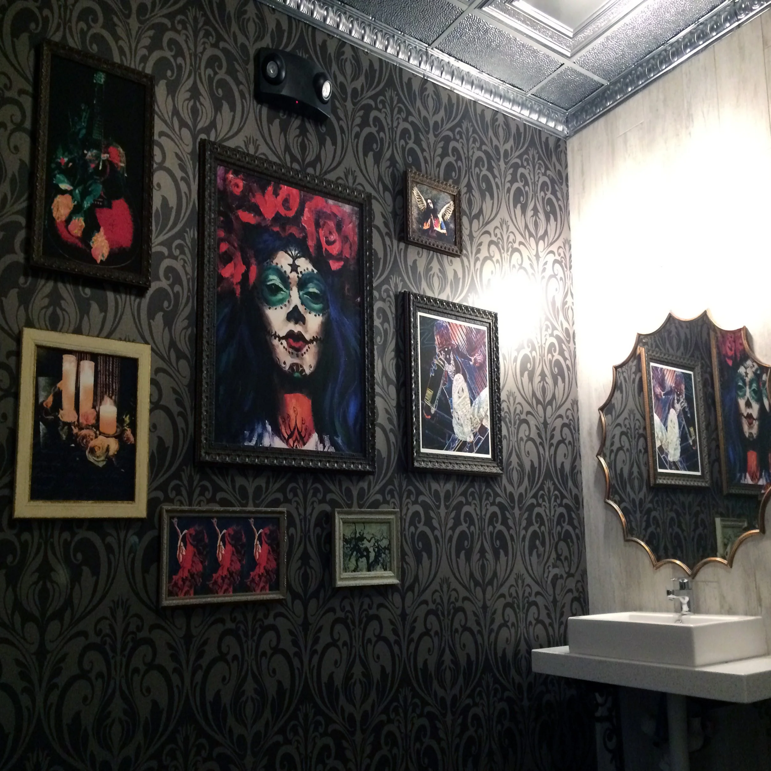
The challenge was to use art, typography, framing, texture, color, and composition to create a believable extension of the character — on time and on budget.
“I didn’t paint the character. I painted what she would have collected and lived with .”
< the exploration
The Quentessa Persona >
Badass Meets Intelligentsia
Independent + Principled
Layered + Mysterious
Frank Yet Generous
Unabashedly Real
Passionate
Perfectly Imperfect
Mysterious
A brand should leave evidence of who it is
Restraint wasn't the personality. The strategy described someone curious, layered, opinionated, sensory, adventurous, and hungry for experience. The persona was a call to street-art culture with a feminine mystique. A neat row of matching artwork would never have communicated that.
What would she collect?
What would she hang on her walls?
What kinds of frames would she choose?
What would reveal her personality without ever showing her face?
The original brand strategy contained an important directive: The Quentessa was never meant to literally appear in the brand. She was to be ever-present through attitude, behavior, language, and experience.
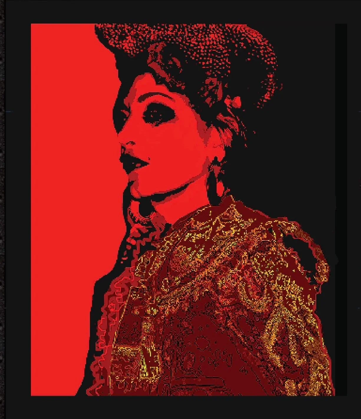
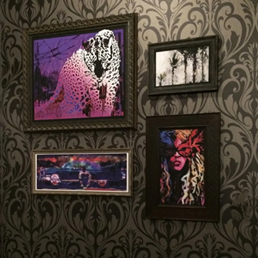
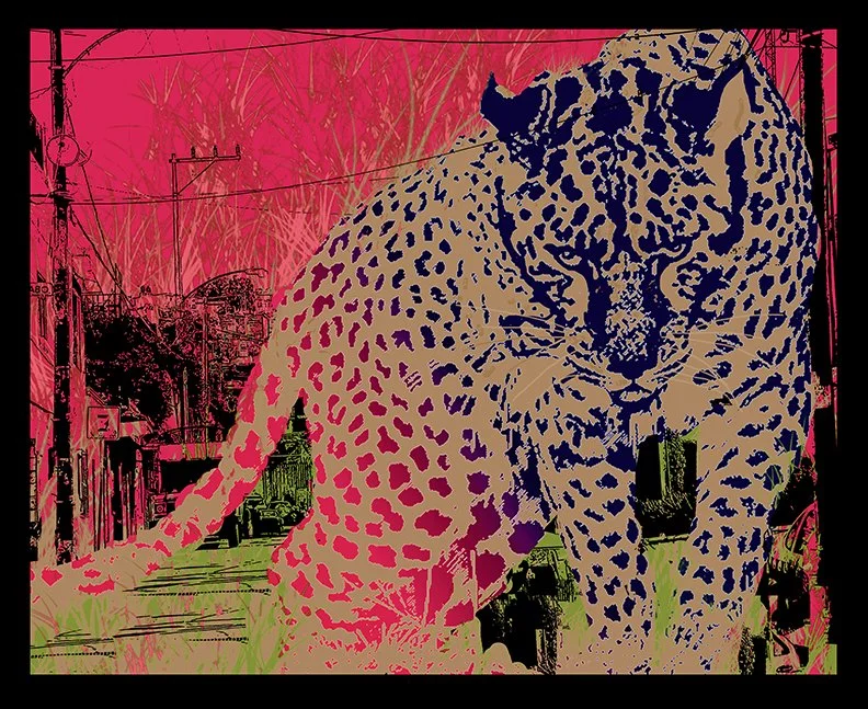
That immediately shaped my approach. I didn’t need to show her. I needed to leave evidence that she had been there. The artwork became evidence of personality — suggesting curiosity, sensuality, confidence, and humor.
That became the creative filter for every decision.
I developed the imagery, selected frames, composed the gallery arrangements, considered scale and placement, and designed custom wallcovering to help create a layered environment.
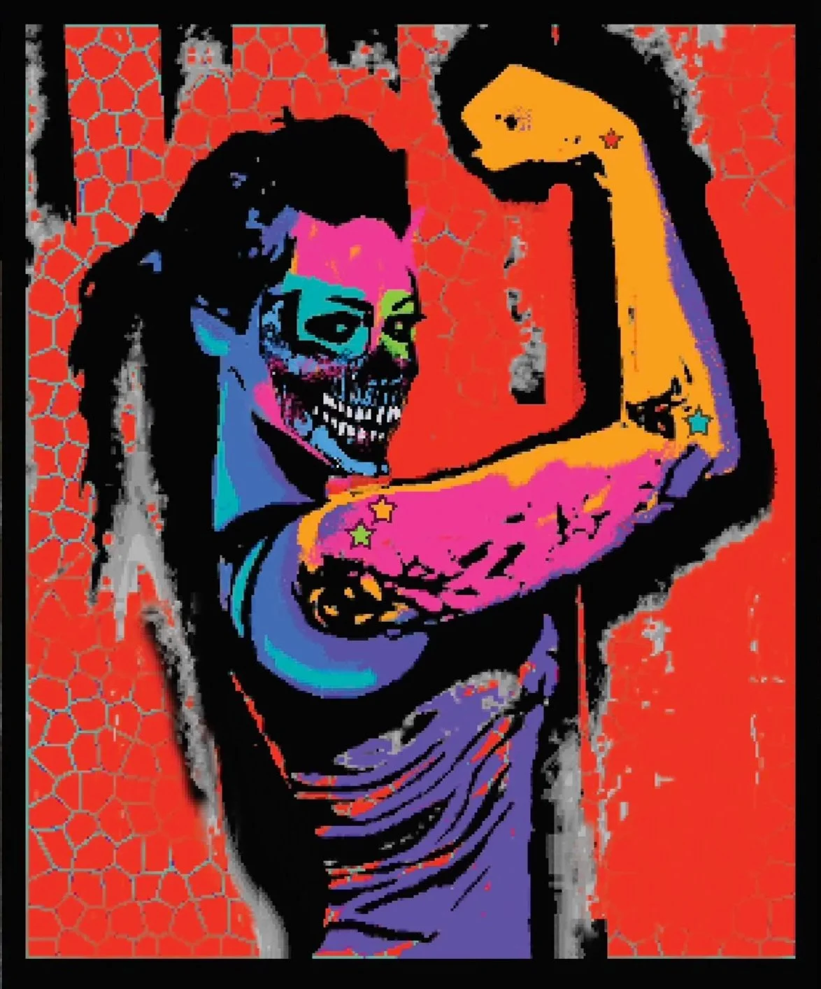
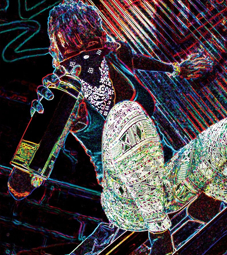
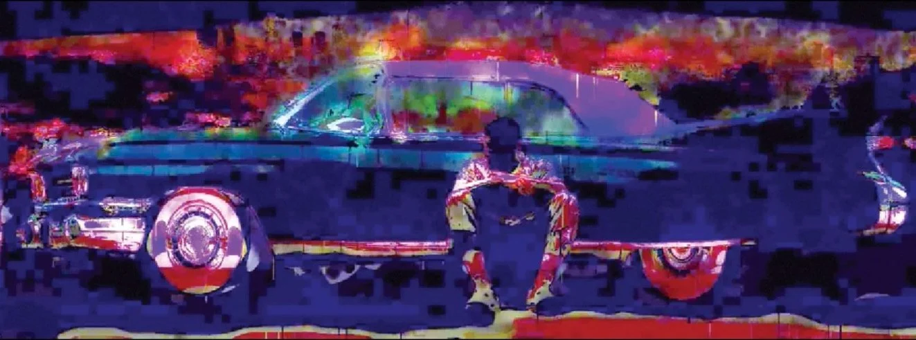
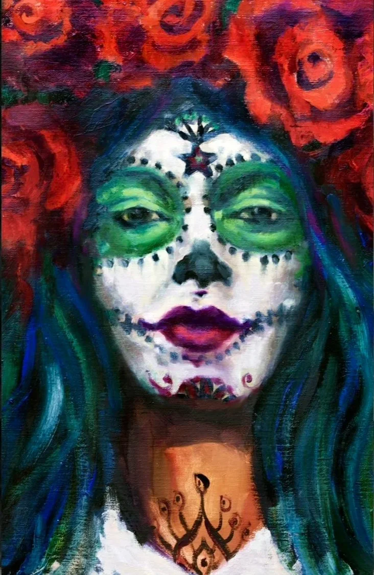
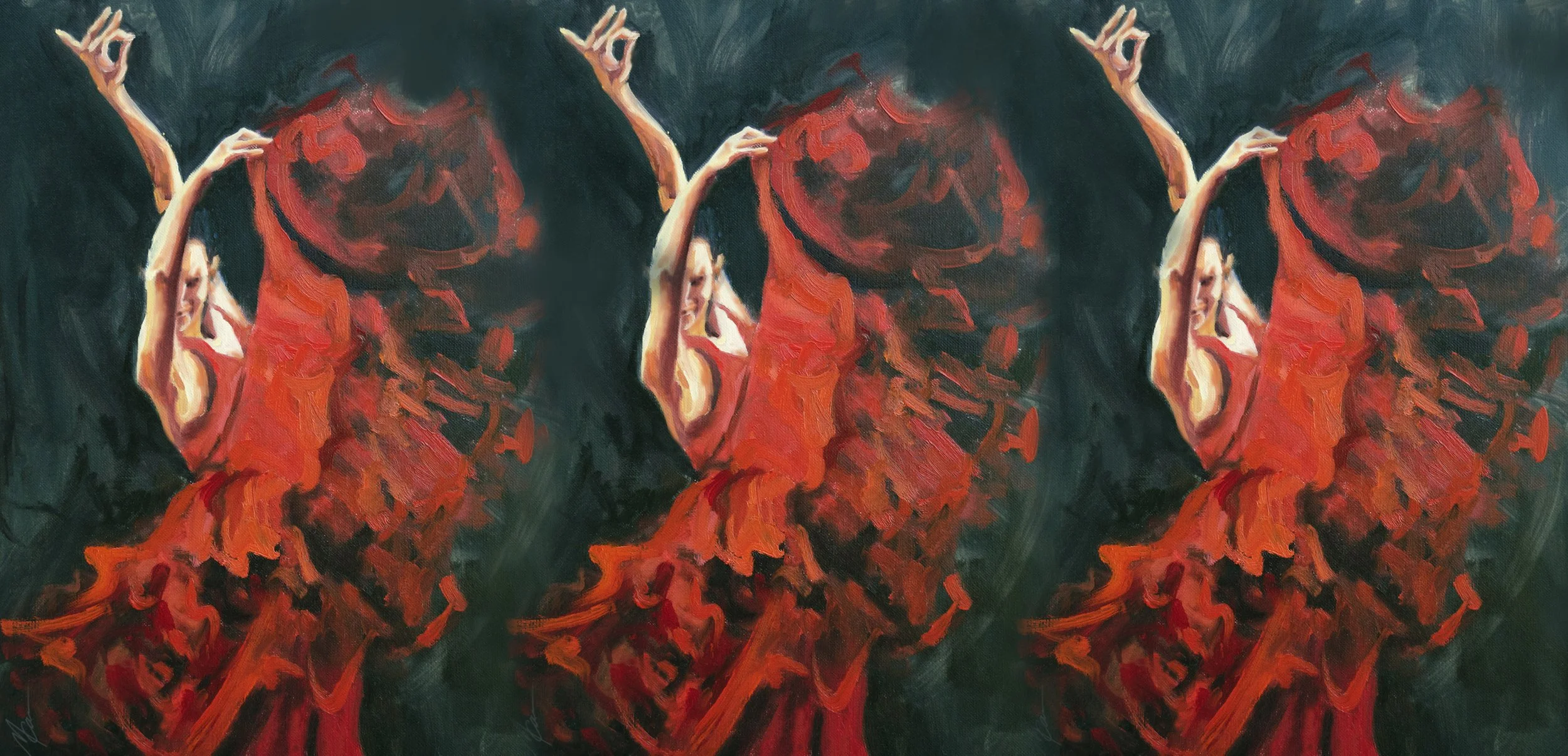
the men's space >
Controlled imperfection became part of the brand language.
Two environments that looked entirely different, but shared the same principle > build the world, not the character.
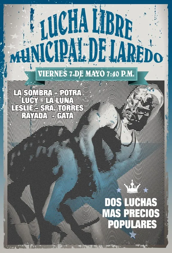
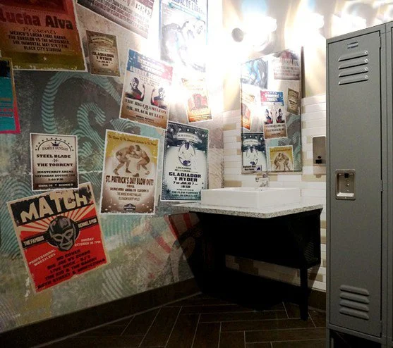
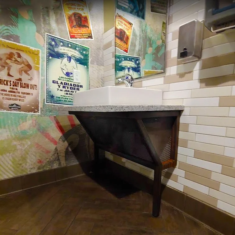
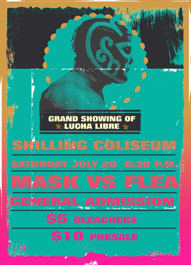
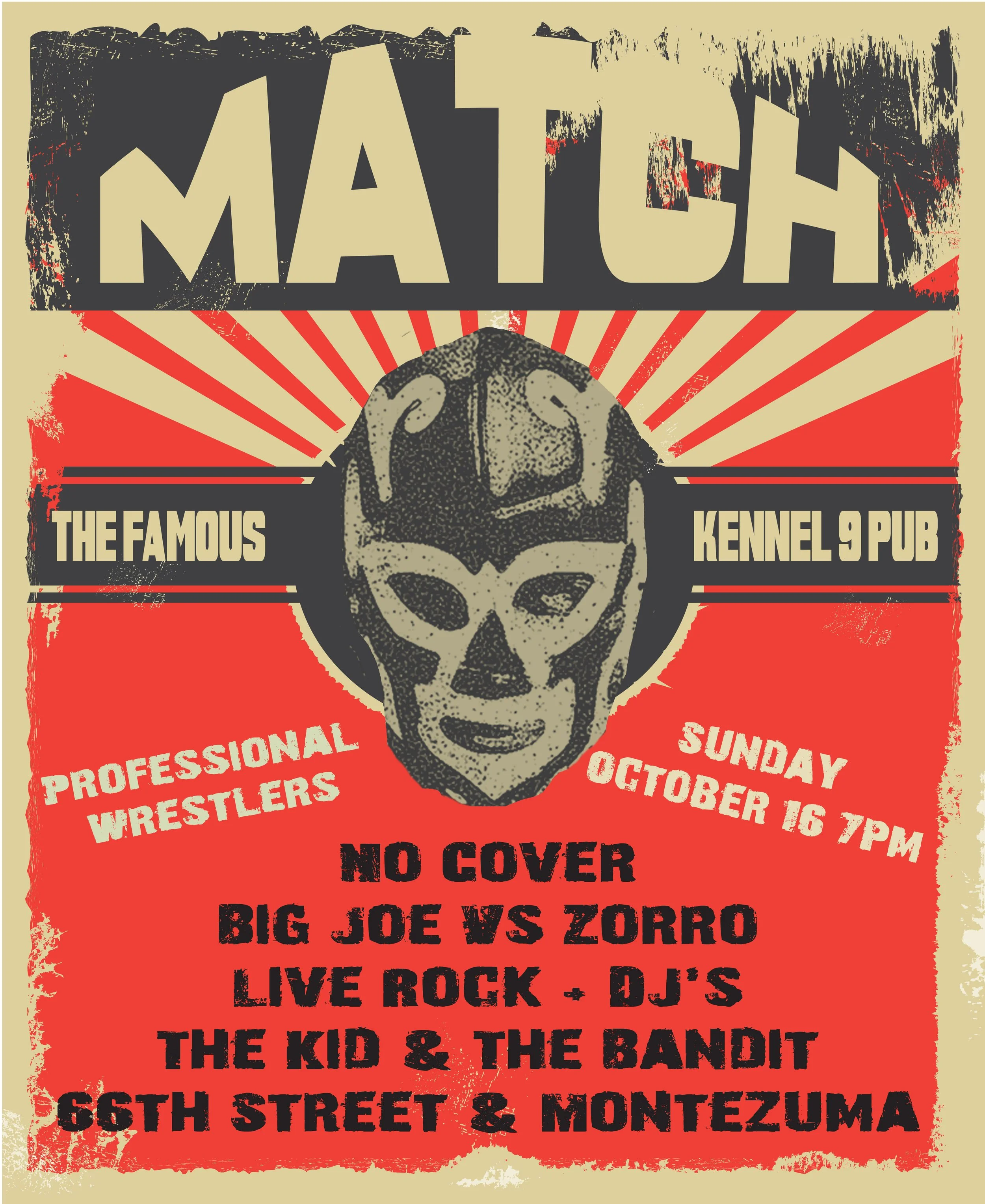
For the men’s space, the existing visual system already drew from modern Mexican and Western iconography, including lucha masks, imperfect edges, and stencil-like graphics. I took those cues further — building a locker-room environment around the visual language of a vintage lucha libre fight poster vibe.
I created original posters inspired by the visual language of historic match bills and wheat-paste street advertising. Bold typography. Dramatic characters. Spanish and English language. Saturated imagery.
The brand guidelines emphasized an identity that was passionate, unabashedly real, and “perfectly imperfect.” I translated that attitude into the environment through layered compositions, rough aging edges, bold typography, imperfect printing, and visual accumulation.
the solution >
30 DAYS
to develop the visual world
50
original artworks + images
1
brand persona brought into physical space
In 30 days, I translated TheQuentessa persona into approximately 50 original artworks and a complete environmental visual language.
I presented the concepts directly to the Qdoba team, including Vice President of Brand Marketing, David Craven. His feedback was that the work captured the interpretation they had been searching for — translating an abstract personality into a believable visual and environmental experience.
The Quentessa already existed. My job was to make her come to life.
— KENDALL PETERSON, Former Chief Creative Director, CIG Public Relations, LLC"An art campaign strategy for Qdoba® restaurants was to visually communicate an "art persona” for the restaurant chain. I worked with Michelle to help with the brand persona of “The Quentessa". Michelle created over fifty original works of art to be reproduced throughout their national restaurant locations. The Chief Marketing Officer and design team were thrilled that Michelle’s work captured the essence and persona of their brand quickly and intuitively. The work she did was rigorous, creative, on time and budget and the client was extremely pleased."
butt seriously…
And Then Stephen Colbert Noticed the Bathrooms…
The project eventually found its way into an unexpected piece of pop culture.
On November 5, 2015, The Late Show with Stephen Colbert featured Qdoba’s “The Quentessa” strategy in a comedy segment about the lengths the brand had gone to bring its fictional customer persona to life.
The bathrooms became part of the joke — including the fact that an artist had been hired to create original artwork specifically for the environments.
My name wasn’t mentioned, and it certainly wasn’t an art-world review.
But the concept had become specific, unusual, and memorable enough to make national television.
Not bad for bathroom art.
< the reflection
“A brand can be beautifully articulated on paper and still feel generic in the real world.”
This project clarified something I still believe about brands today: strategy alone is not enough.
For me, the real lesson was that creative direction is often about closing the gap between an abstract idea and a lived experience. That is still central to how I work — I look for the point where identity stops being something people are told and becomes something they can actually feel.
case studies
-
![]()
Sebastopol Center for the Arts
-
![]()
Red Touch Media
-
![]()
Qdoba Mexican Eats
-
![]()
City of Wheat Ridge