

the assignment >
Turning Community Character Into a Citywide Identity
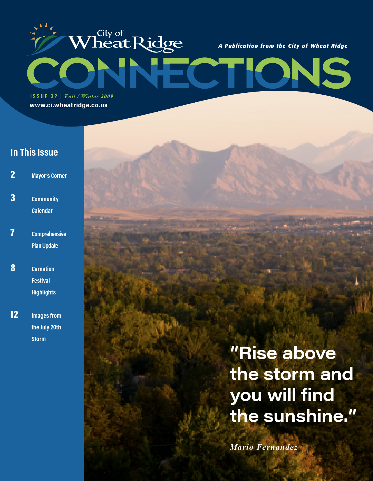
Working with CIG PR, I served as the creative lead and designer for the City of Wheat Ridge rebrand — developing the visual identity and carrying it through a comprehensive citywide system.
My role was to translate community research, civic priorities, and public input into a brand that could help Wheat Ridge move forward without losing the character residents valued.
2007 - 2009
PROJECT AT A GLANCE
40+ stakeholder interviews
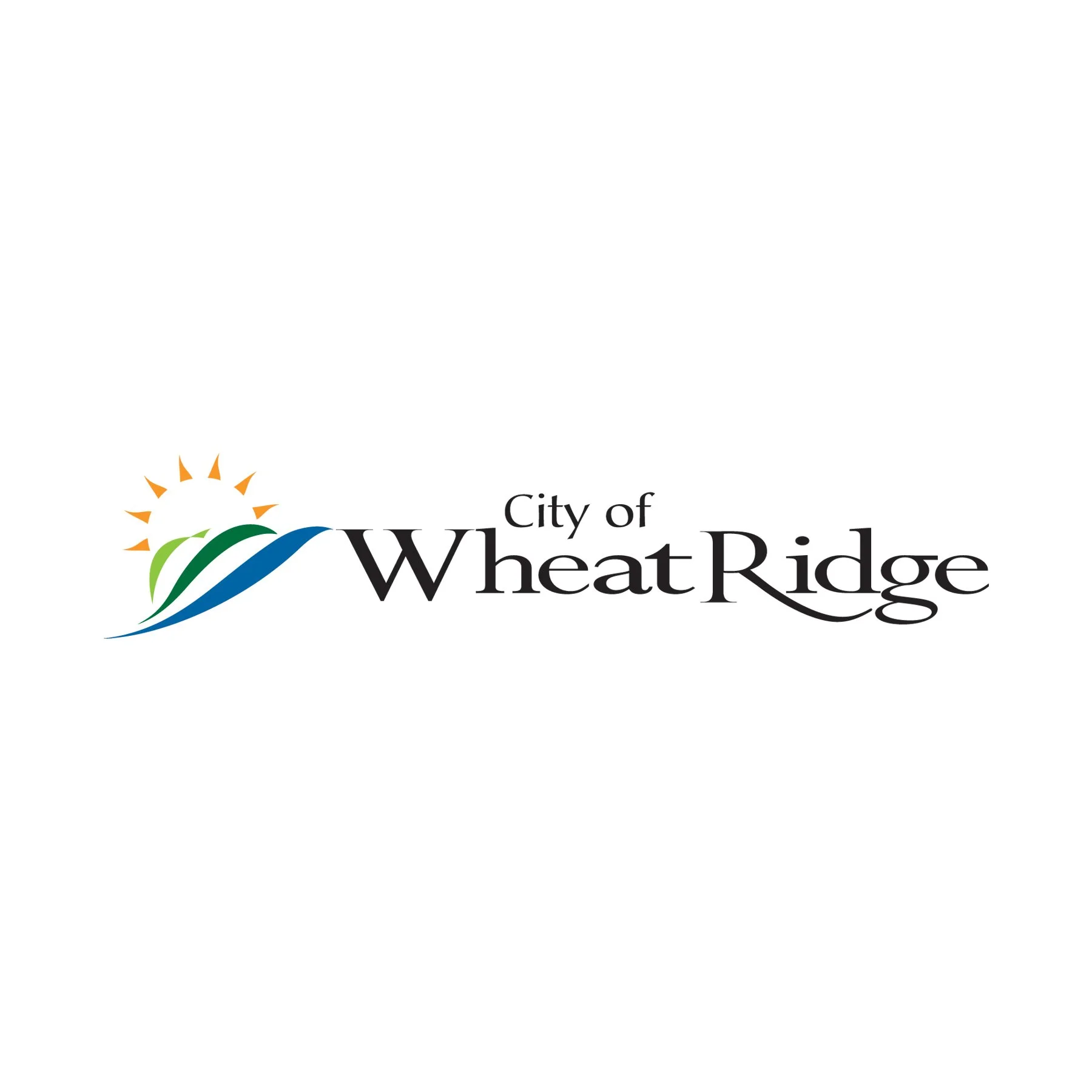
Brand identity + visual system
City + departmental applications
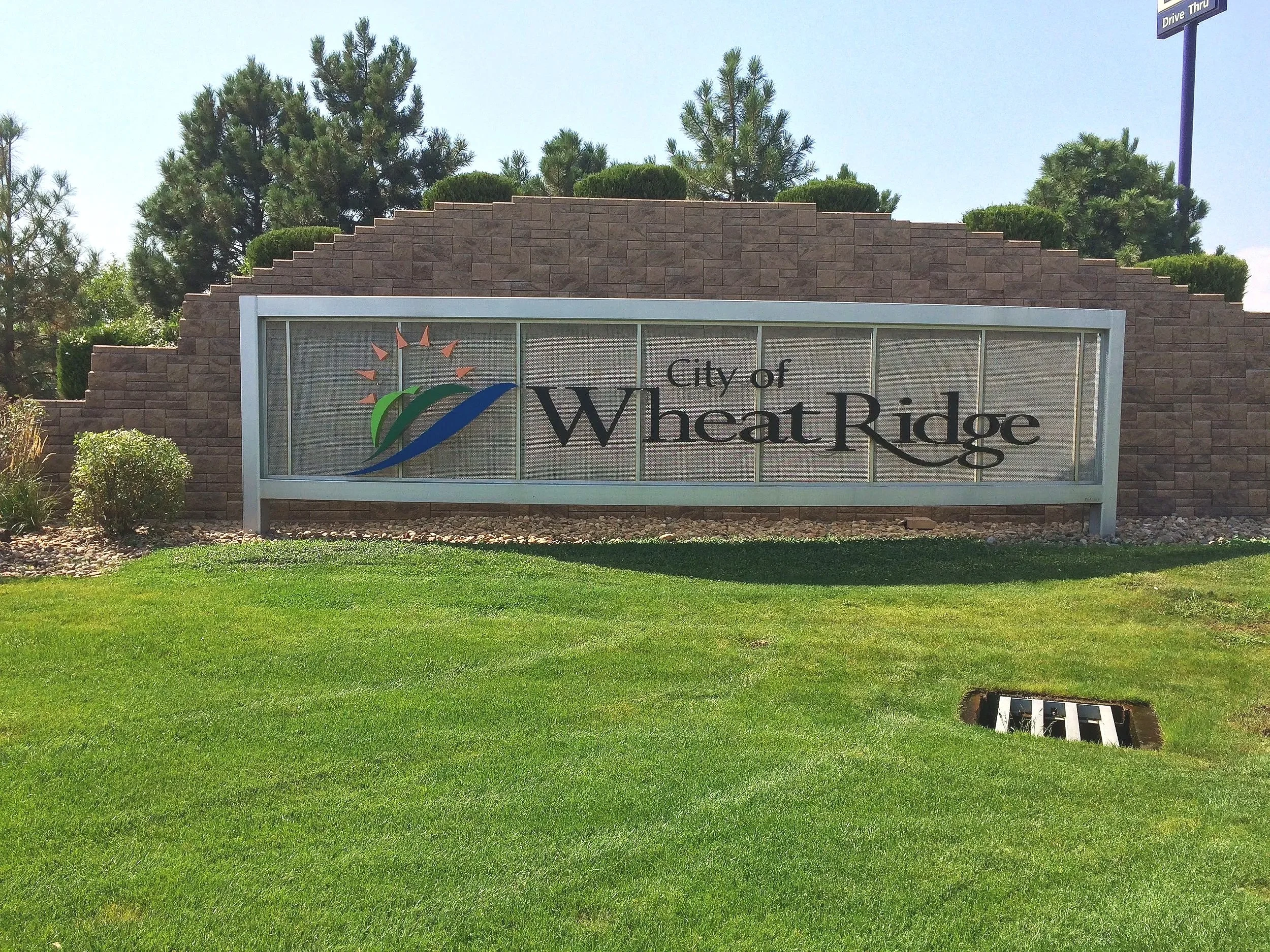
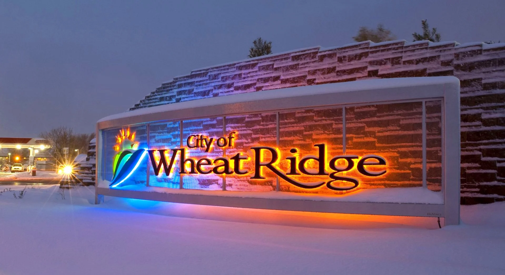
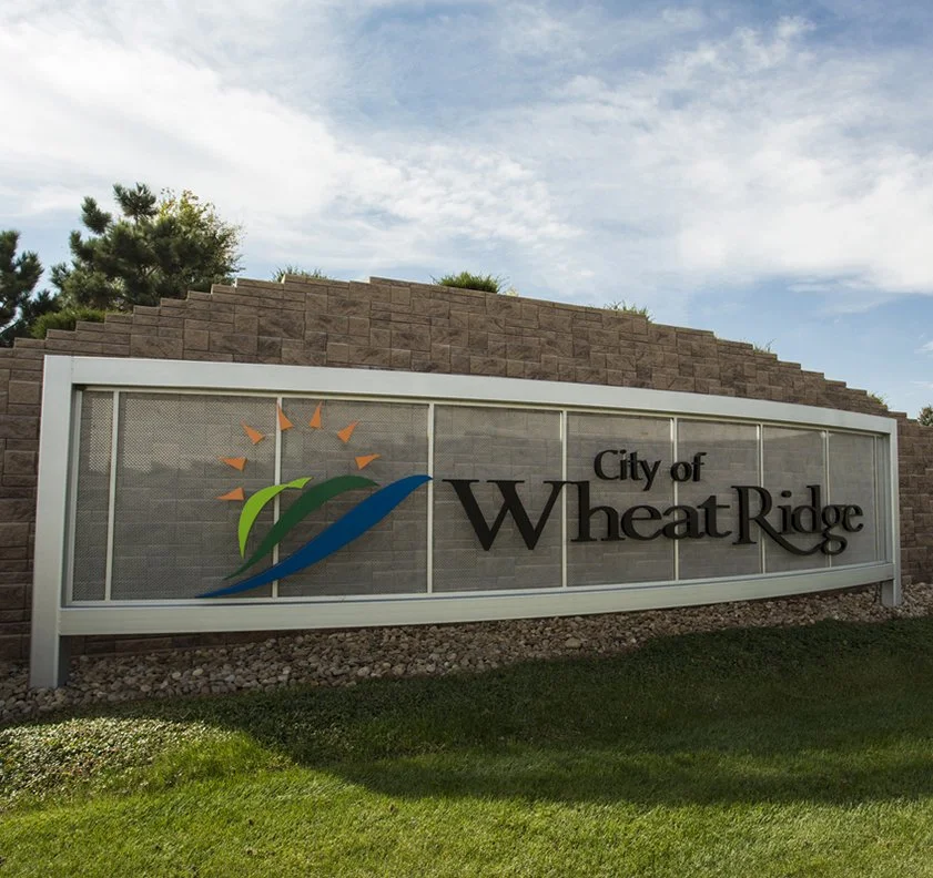
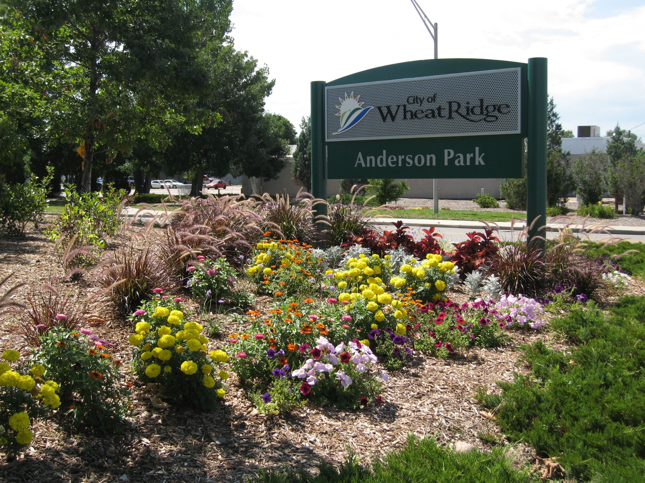
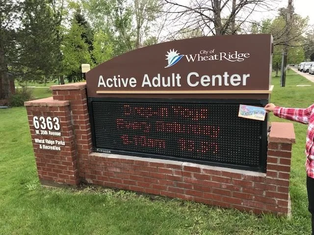
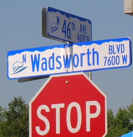
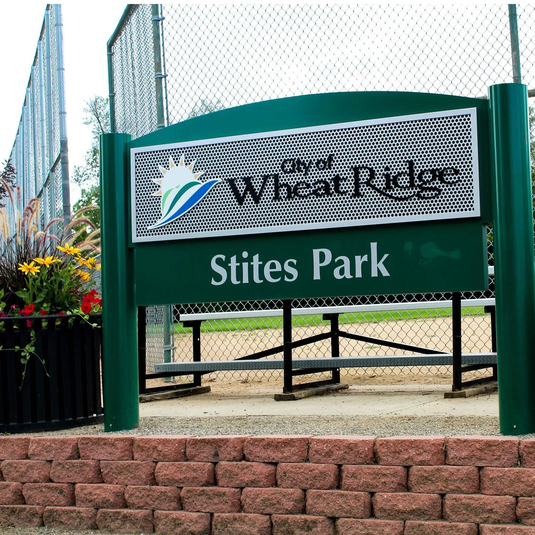
Signage + wayfinding
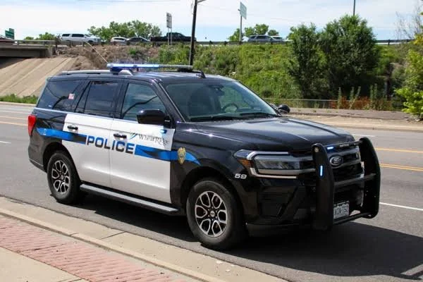
Police + municipal vehicles + badges
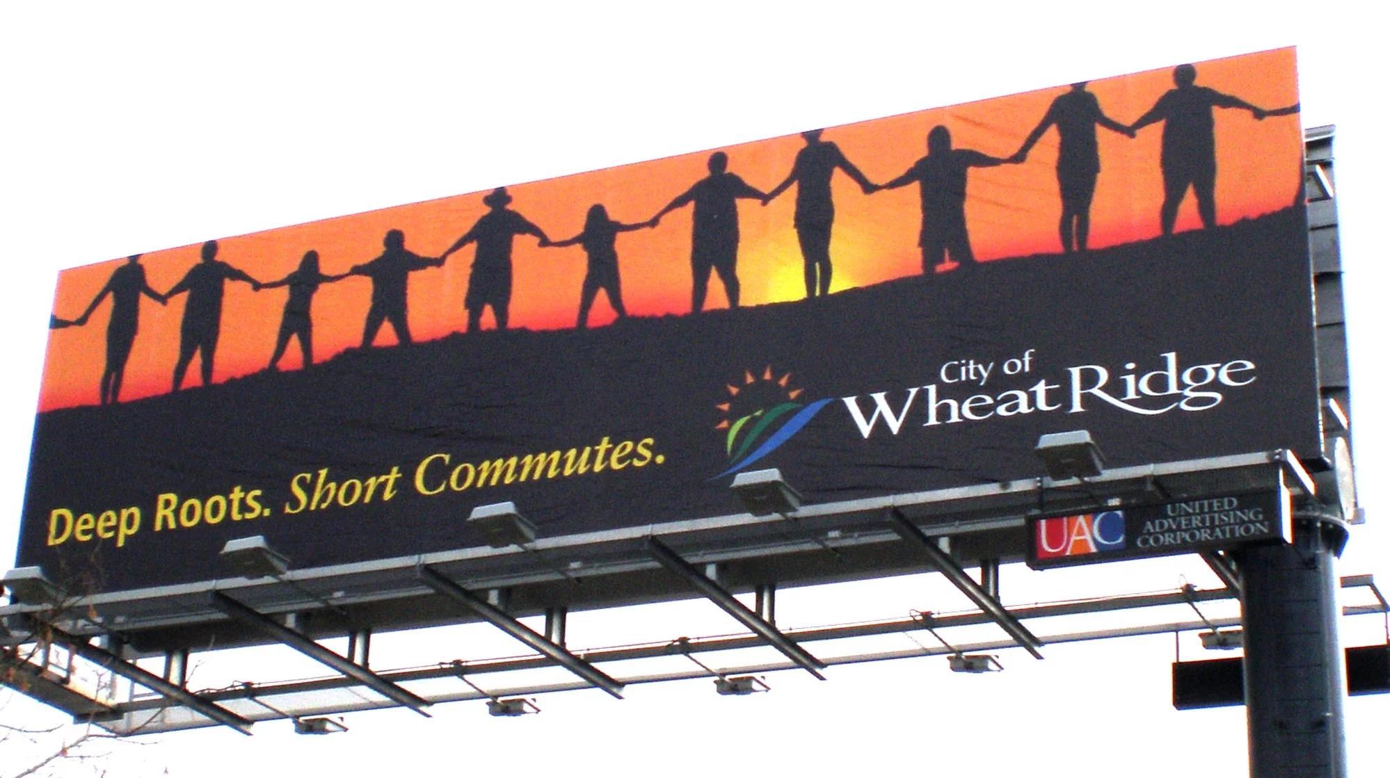
Advertising + billboards
Connections newsletter
Environmental graphics
Brand standards
the creative challenge >
Growth Without Becoming Generic
In 2007, Wheat Ridge was competing within a rapidly changing Denver metro area for investment, businesses, development, and new residents.
But modernization was a sensitive subject. The city had deep agricultural roots, long-time residents, and a strong sense of independence. Some welcomed growth; others worried about losing what made Wheat Ridge feel like home.
The challenge was to create an identity that could hold both sides of that tension:
Signal progress without erasing history.
Create opportunity without losing familiarity.
Modernize without making Wheat Ridge look like every other suburb.
The goal wasn’t simply to make the city look newer. It was to give Wheat Ridge a visual identity that could carry its history, character, and ambition at the same time.
< the exploration
Several themes surfaced consistently:
Sense of place
Community + pride
Welcoming + approachable
Connectivity
Recreation + open space
Energy + opportunity
Turning Community Insight Into a Visual Identity
The process began with more than 40 stakeholder interviews, supported by public presentations, surveys, and community outreach.
Working with CIG’s communications team, I used that research to define the creative direction — looking for the visual idea that could connect what residents already valued with what city leadership wanted Wheat Ridge to become.

the solution >
A Brand Built to Last
The City of Wheat Ridge rebrand received the 2008 3CMA Savvy Award, national recognition from the City-County Communications & Marketing Association.
But the stronger measure is longevity.
Nearly two decades later, the identity remains in use across city communications, signage, vehicles, public spaces, and municipal services — becoming part of Wheat Ridge’s everyday visual landscape as the community continued to grow and evolve.
The city has attracted new investment and development while retaining the independent character, accessibility, and sense of community that informed the brand from the beginning.
2008 3CMA Savvy Award
Nearly 20 years of continued use
One identity extended across communications, vehicles, signage + public space
For a brand created to bridge Wheat Ridge’s past and future, its continued relevance is one of the clearest measures of success.
< reflection
“A strong identity doesn't manufacture a sense of place. It finds what is already there, gives it form, and helps people see what that place can become.”
This project shaped the way I still think about brand leadership and placemaking.
A strong identity doesn’t begin with aesthetics. It begins with understanding what is already true — the history, culture, tensions, aspirations, and character that make a place distinct.
The creative work is deciding what matters, finding the idea that holds it together, and building a visual system strong enough to carry that idea into the real world.
case studies
-
![]()
Sebastopol Center for the Arts
-
![]()
Red Touch Media
-
![]()
Qdoba Mexican Eats
-
![]()
City of Wheat Ridge