

ROLE
Visual Communications + Marketing Director
2022-2026
SCOPE
Brand Strategy + Identity
Creative Direction
Integrated Marketing
Digital + Environmental Experience
Cultural Program Branding
Internal + External Team + Production Leadership
the assignment >
Many Programs. One Recognizable Art Center.
I joined Sebastopol Center for the Arts, a 501(c)(3) nonprofit arts organization, during a pivotal period of rebuilding.
SebArts had strong programs, deep community loyalty, and significant cultural equity — but its identity, communications, and public experience had become fragmented.
As Visual Communications and Marketing Director, I held a dual leadership role across the institution: building the brand and building the marketing system that carried it into the world. I led visual identity, creative direction, brand experience, audience strategy, campaigns, media, and communications — responsibilities that, in a larger institution, often sit across separate leadership functions.
My mandate was to create the organization’s first unified visual identity and build a more cohesive public experience across digital, exhibitions, environment, fundraising, and audience engagement.
The strategic question behind the work was simple:
How could SebArts become more recognizable without competing with the art it existed to present?
SebArts needed a contemporary identity, a stronger public presence, and a system that could connect its many programs without flattening what made each one distinct.
< the creative challenge
More Than a New Logo
SebArts served many different audiences, but those experiences didn’t always feel connected. Strategic planning also revealed broader perception issues: the organization could feel dated, insular, and unclear about what it offered.
the exploration >
The People Behind the Institution
Before designing the identity, I looked at how people actually encountered SebArts — through an exhibition, Open Studios, the Film Festival, a class, a fundraiser, the website, and the building itself.
The opportunity was to connect those experiences without forcing them into a single visual formula. I began defining what needed to remain consistent, where individual programs needed their own voice, and how each touchpoint could strengthen recognition of the larger institution.
That thinking became the foundation for the brand system, marketing strategy, and physical experience that followed.

< the solution
Building the Brand
A Brand That Could Lead — and Know When to Step Back
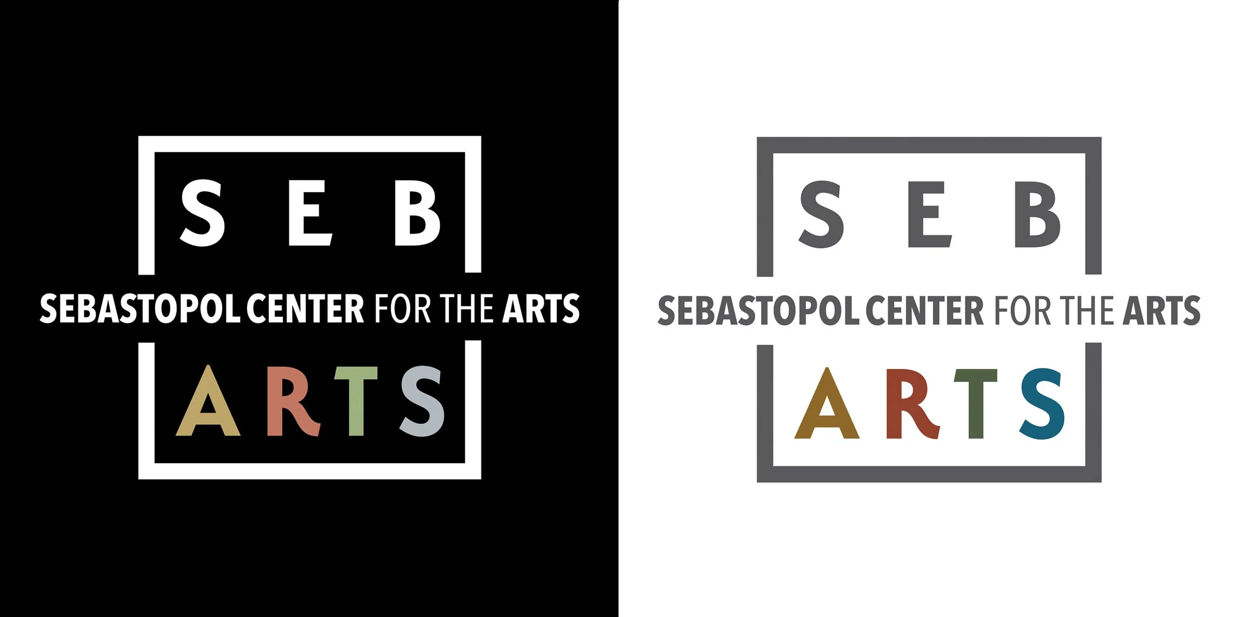
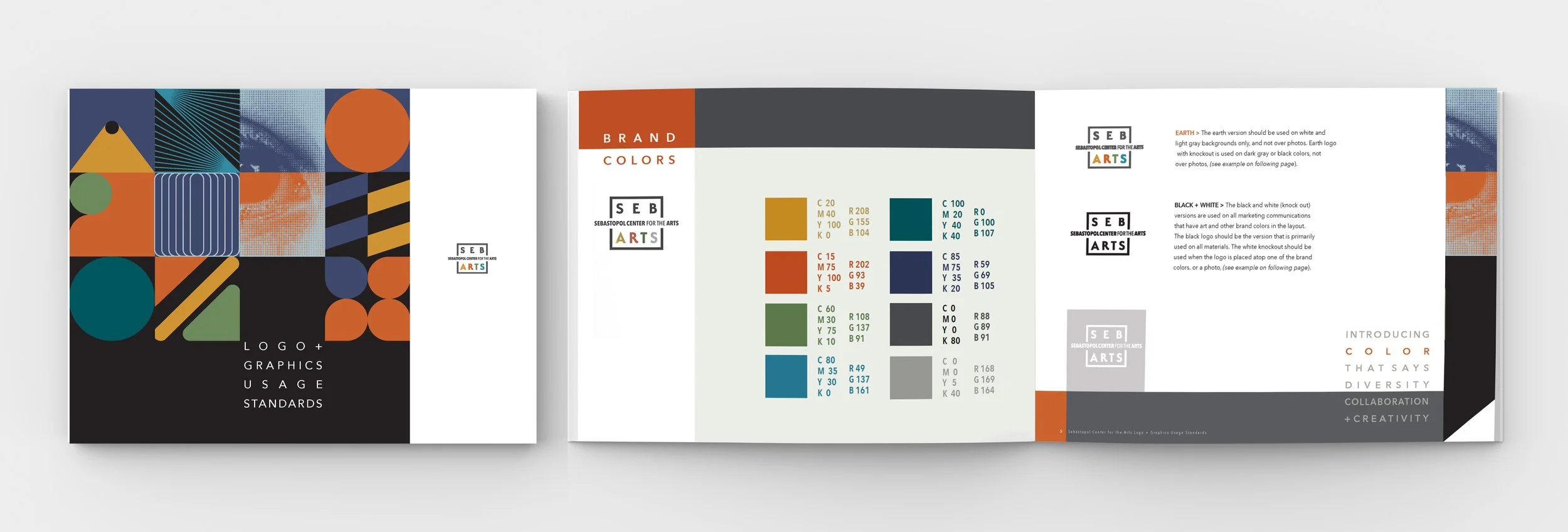
The mark was intentionally restrained. The open square suggests structure without confinement — a subtle expression of creative thinking beyond the expected frame. A muted palette derived from primary colors connects naturally to art-making, but with enough sophistication to avoid feeling juvenile or visually competitive. The typography follows the same principle: clean, modern sans serif forms with a broad range of weights, creating a flexible system for everything from exhibition posters to institutional communications.
That restraint became central to the strategy. The brand needed to be distinctive enough to build recognition, but quiet enough to let the artist, exhibition, film, or program take visual priority. From the mark outward, I developed a flexible system of color, typography, hierarchy, and usage standards designed to work consistently across programs, campaigns, digital platforms, and physical environments.
Building the Marketing
Creating the Engine Behind the Brand
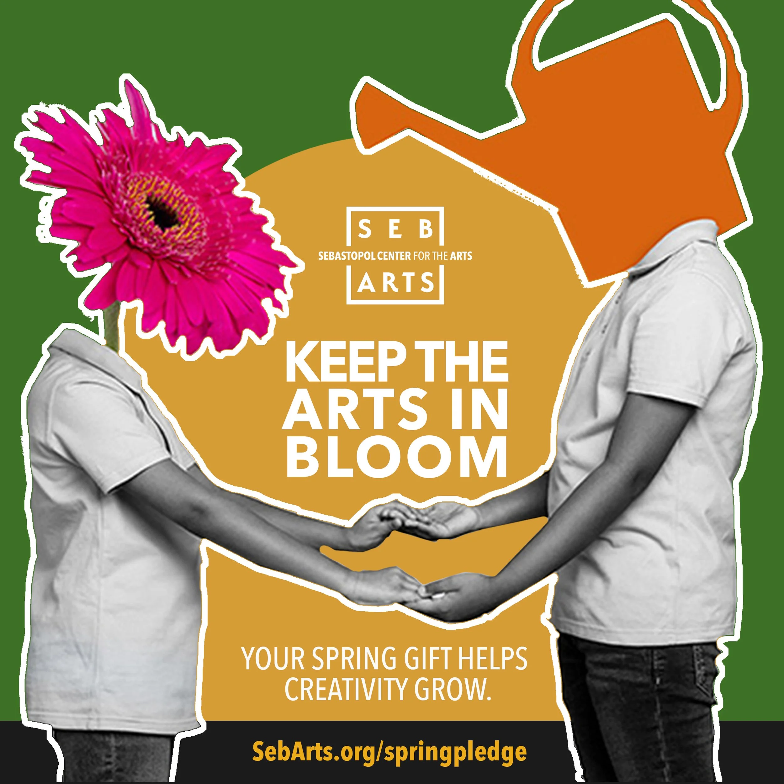
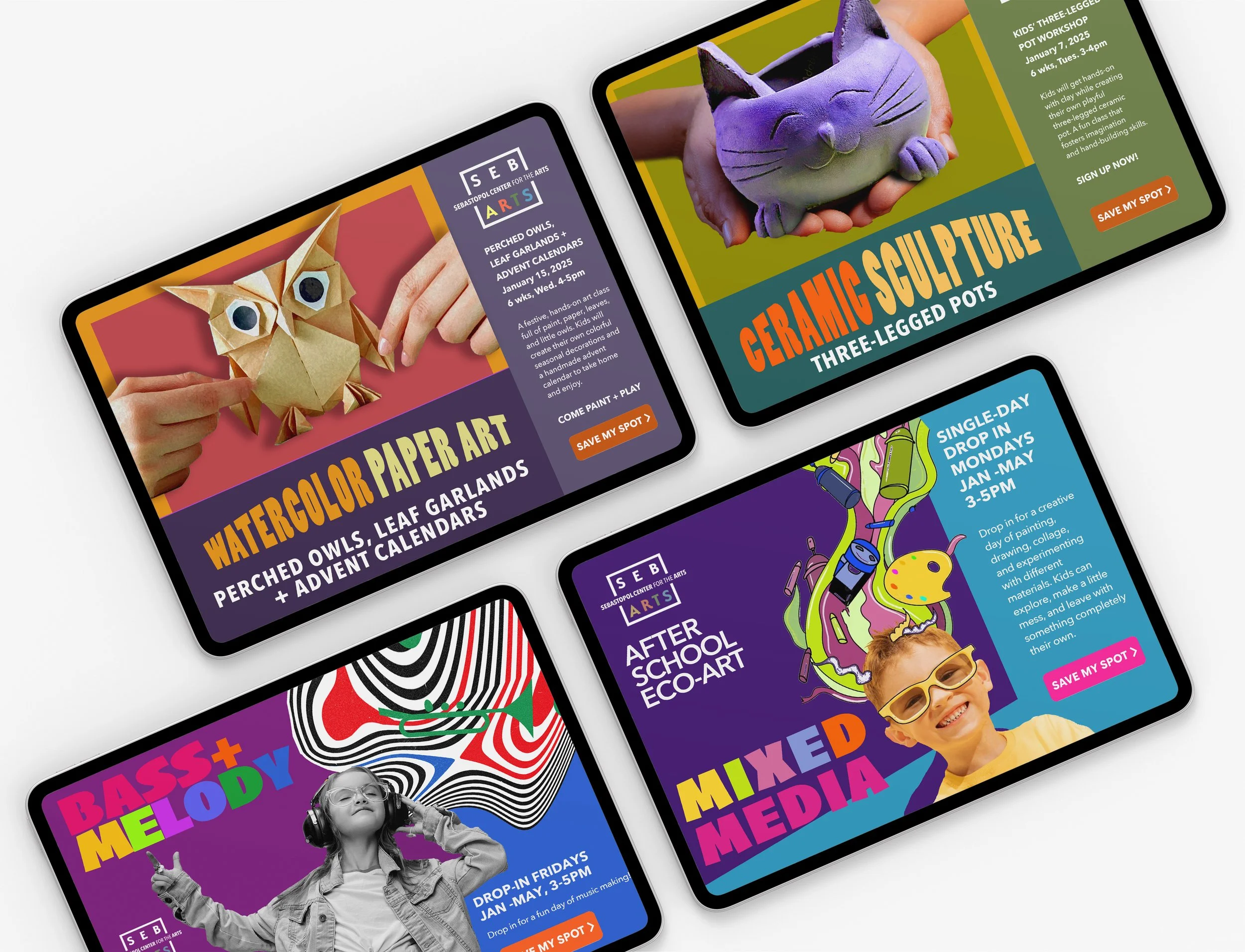
I developed SebArts’ first cohesive organization-wide marketing and advertising strategy, connecting programs, exhibitions, events, fundraising, and institutional initiatives under one coordinated approach.
I established the annual marketing calendar, directed audience and campaign strategy, managed marketing and print budgets, oversaw the external social team, and collaborated with PR partners on regional and national media outreach.
I also developed media partnerships with NPR, NorCal Public Media, and local radio, strengthened vendor and production relationships, and created sponsorship and donor communications that made SebArts’ reach, audiences, and cultural value more visible to potential partners.
the exhibitions >
Major Exhibitions + Cultural Programming
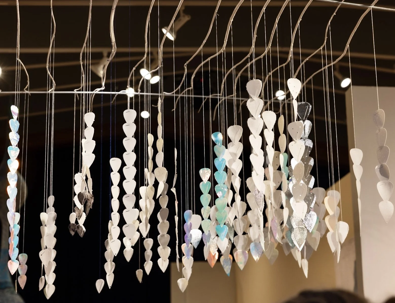
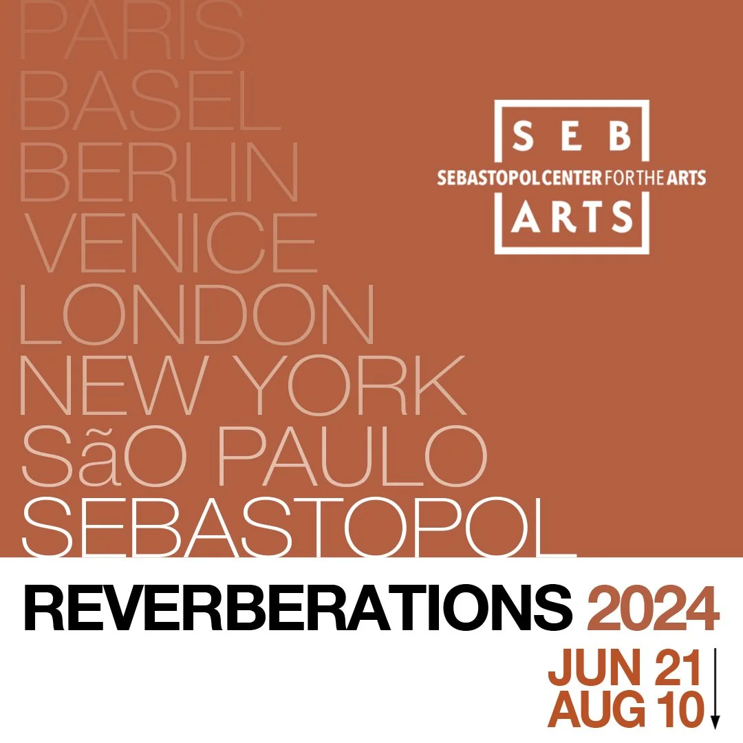
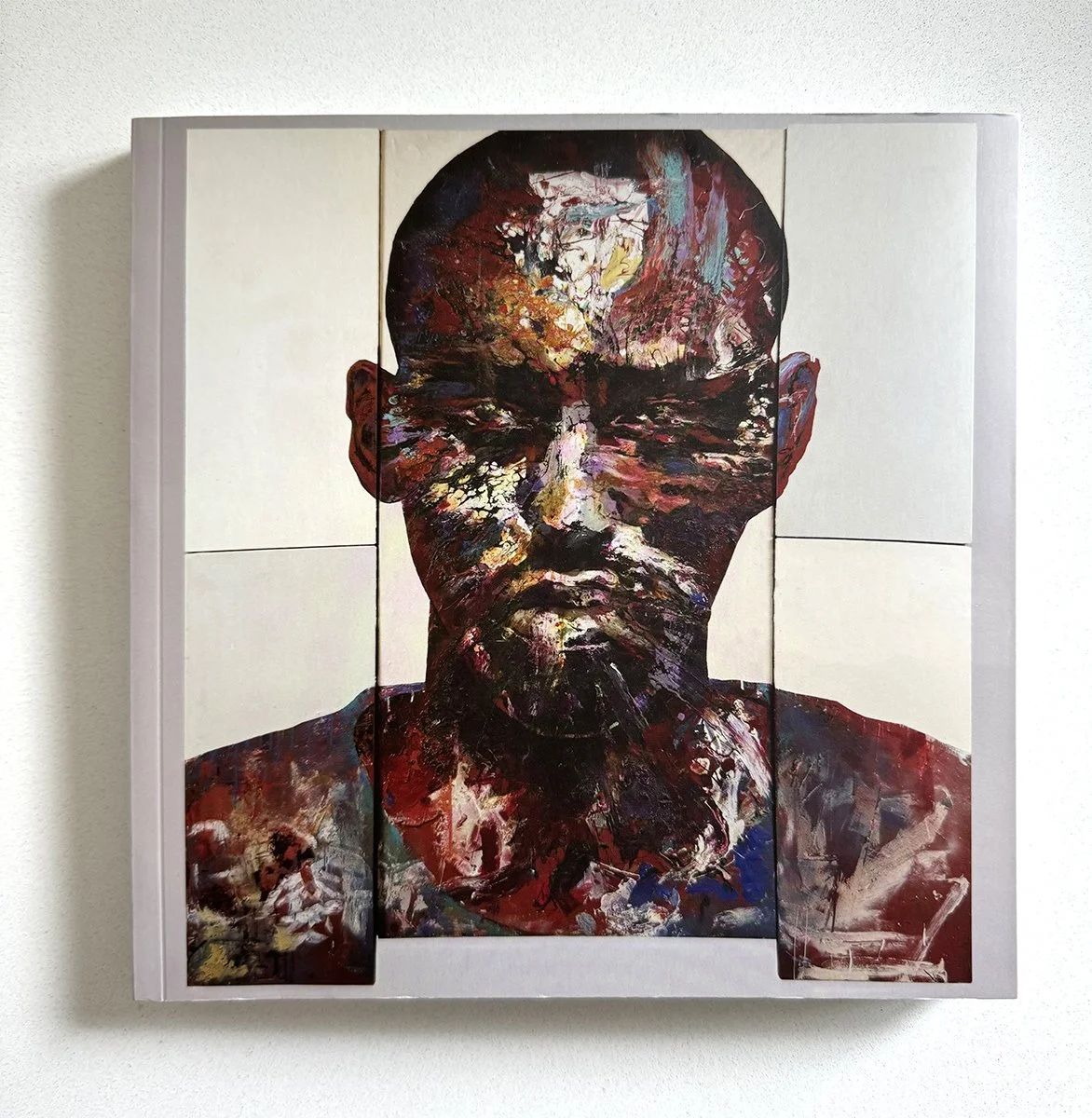
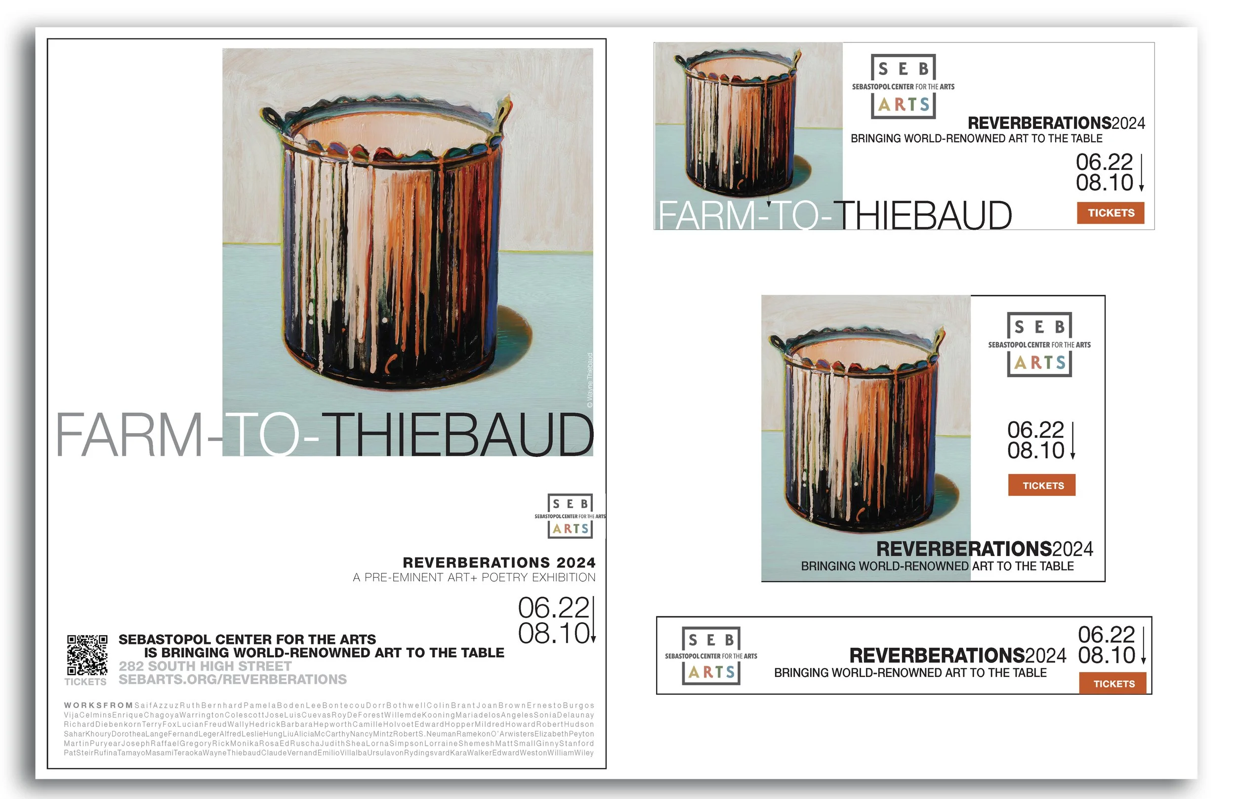
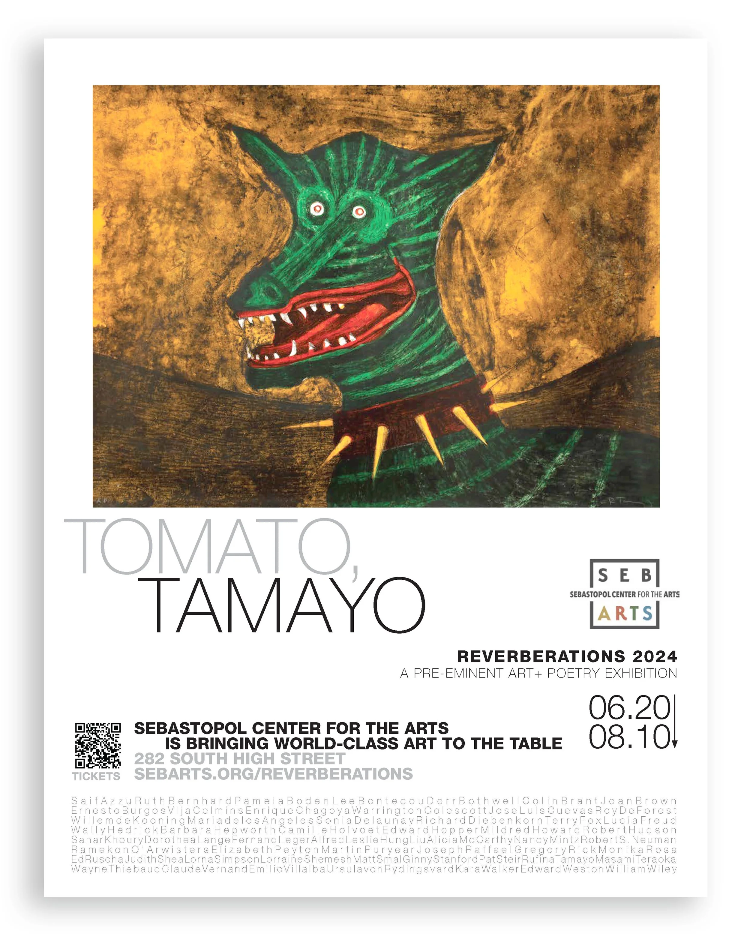
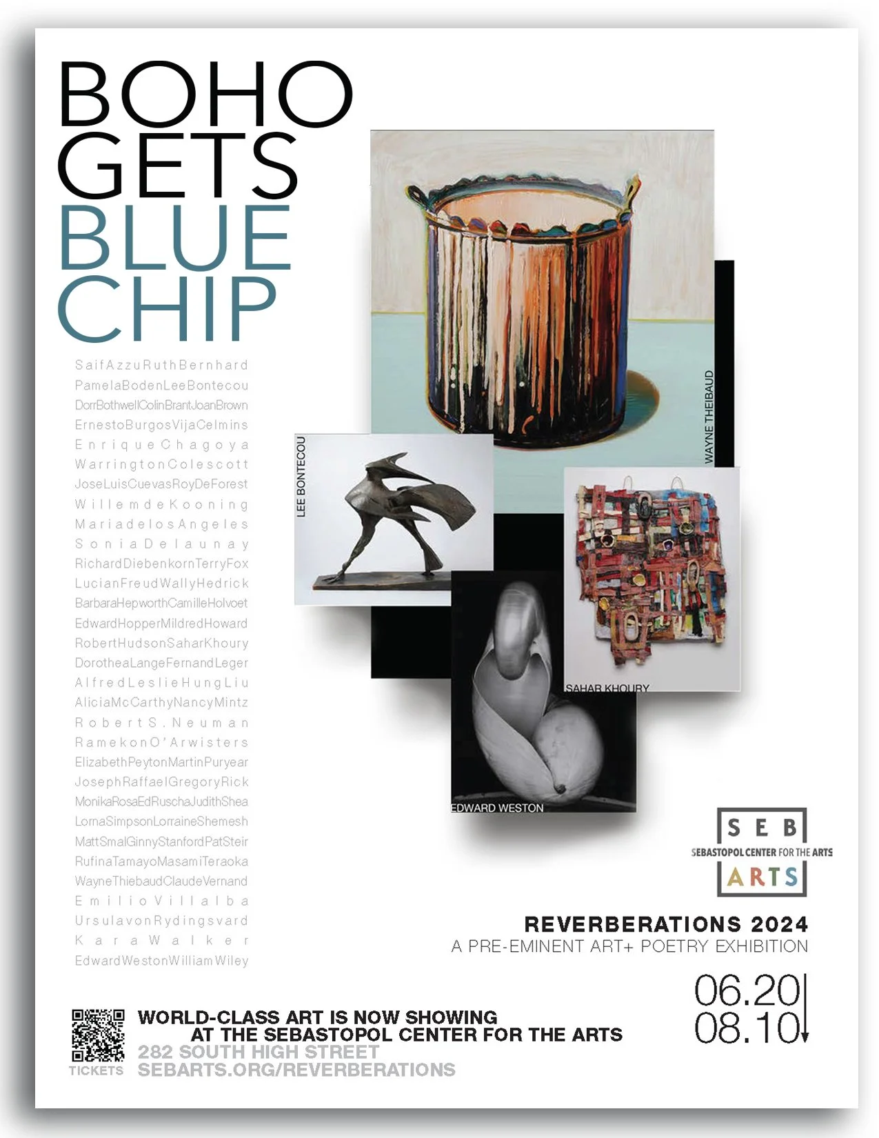
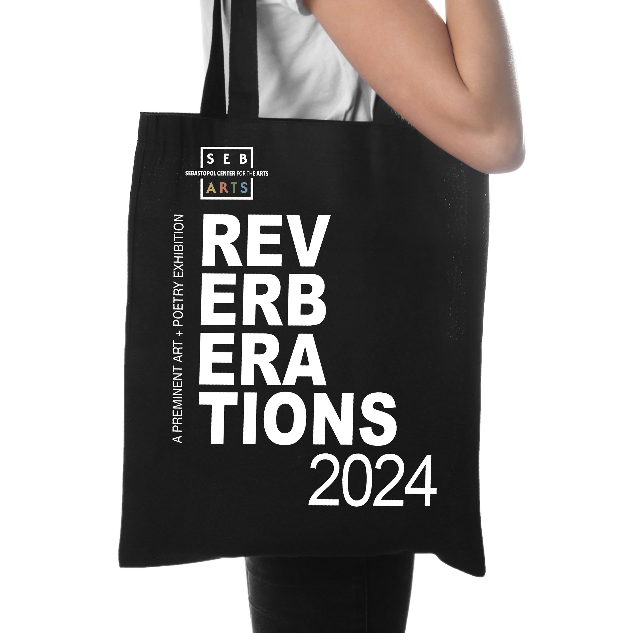
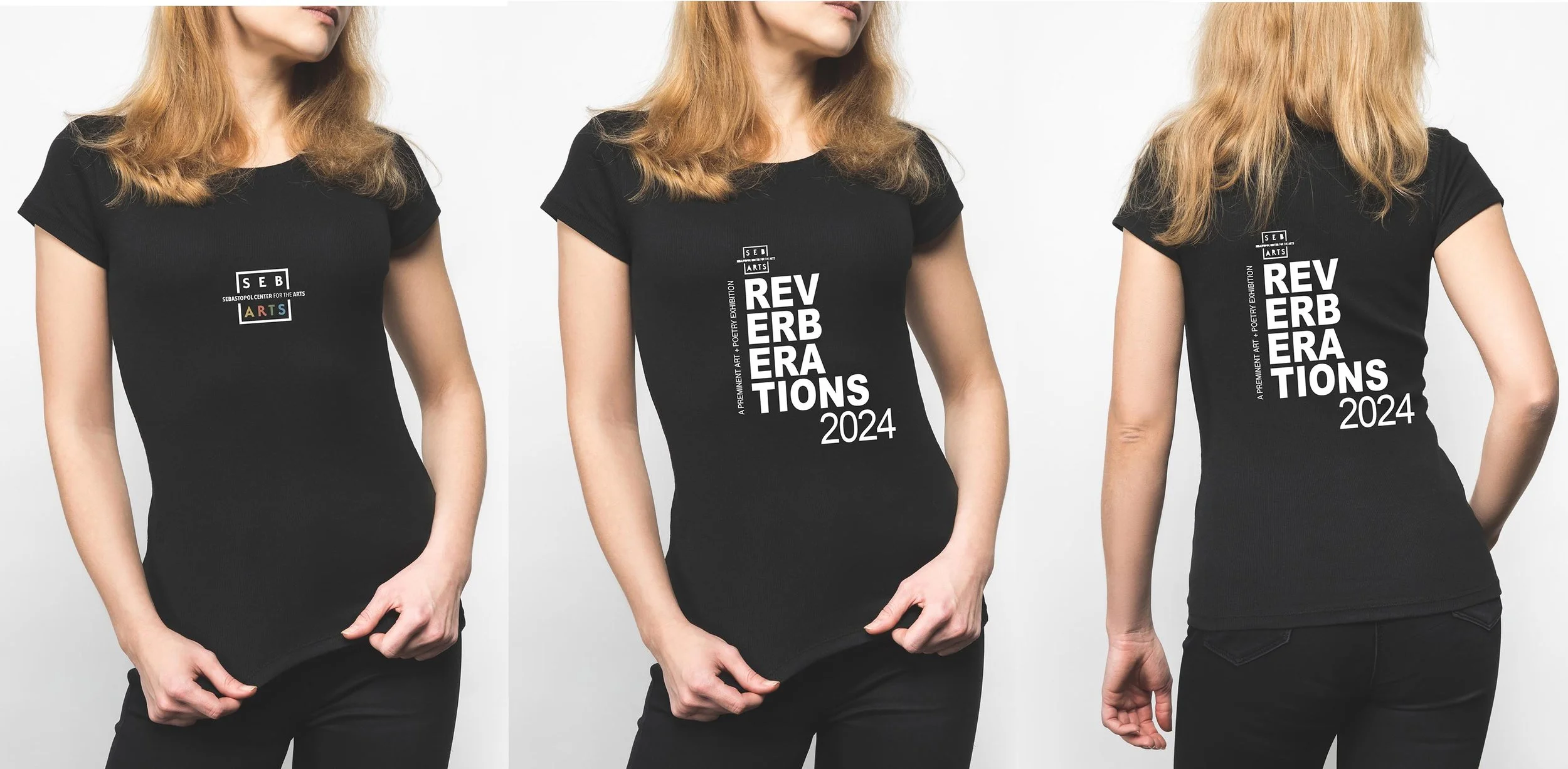
For Reverberations 2024, I led the visual and marketing direction for an exhibition pairing 56 rarely seen works from private collections with 56 original ekphrastic poems, including work by Wayne Thiebaud, Edward Hopper, Richard Diebenkorn, Willem de Kooning, Lucian Freud, Saif Azzuz, Maria de los Angeles, and Alicia McCarthy.
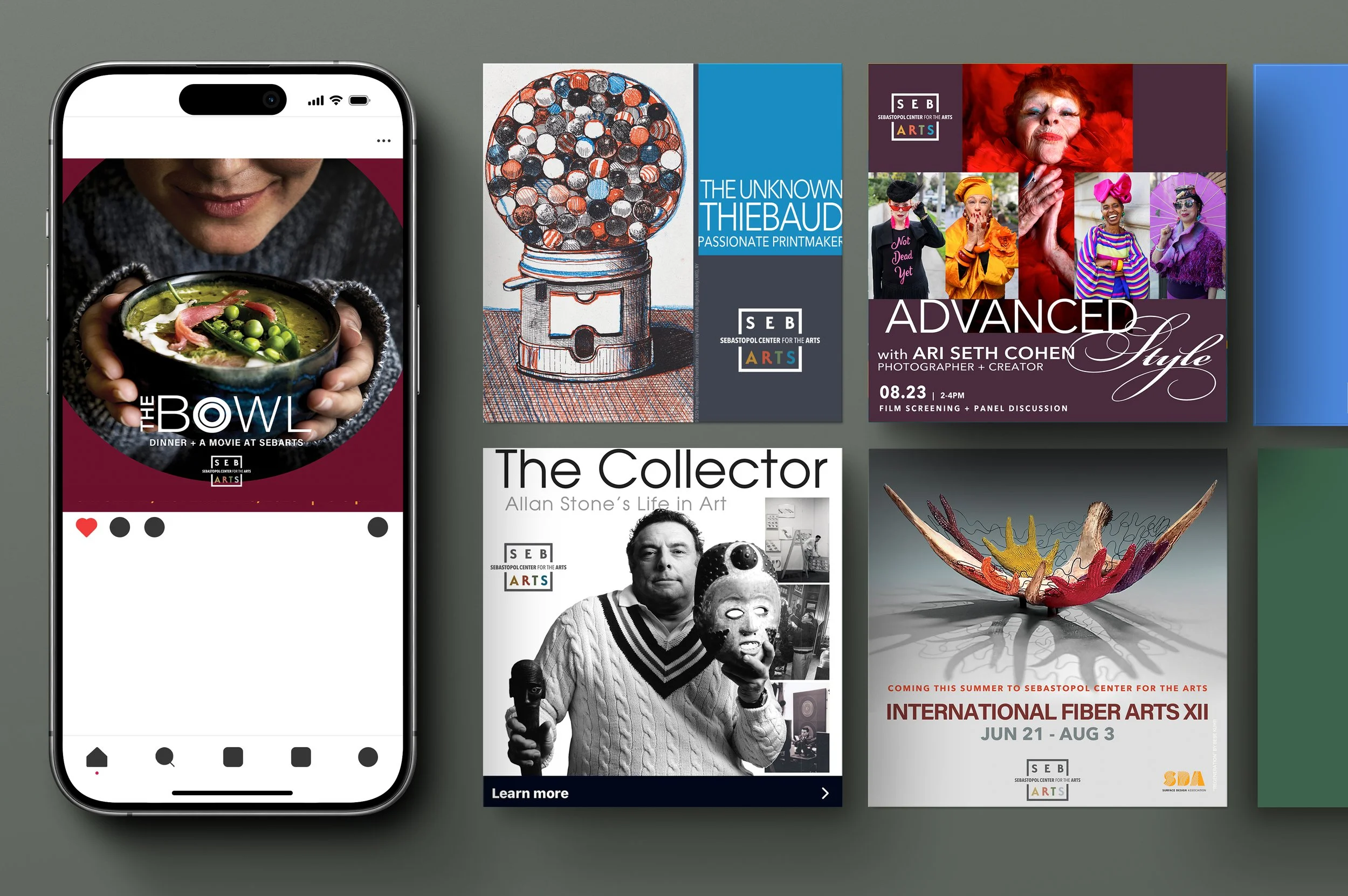
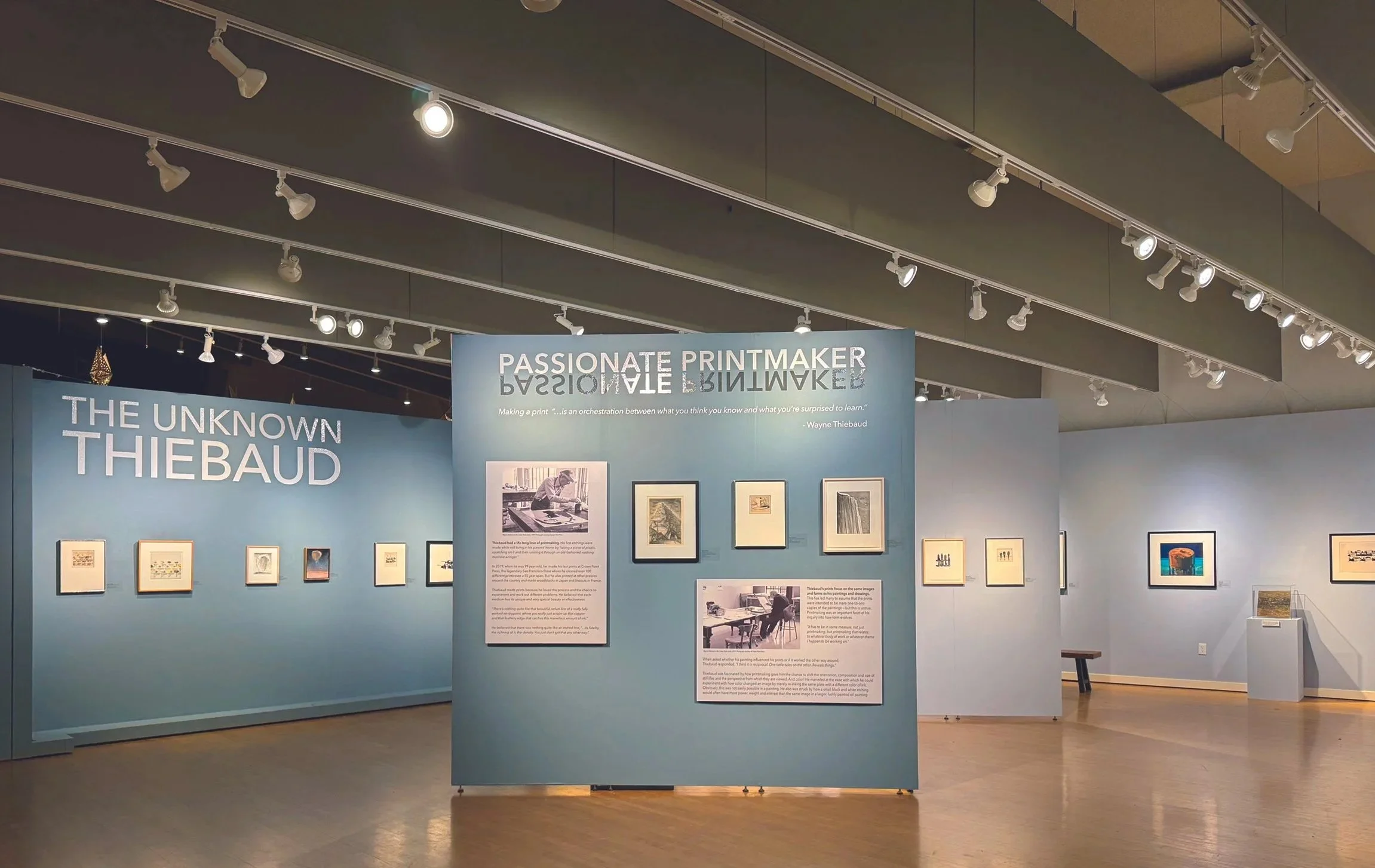
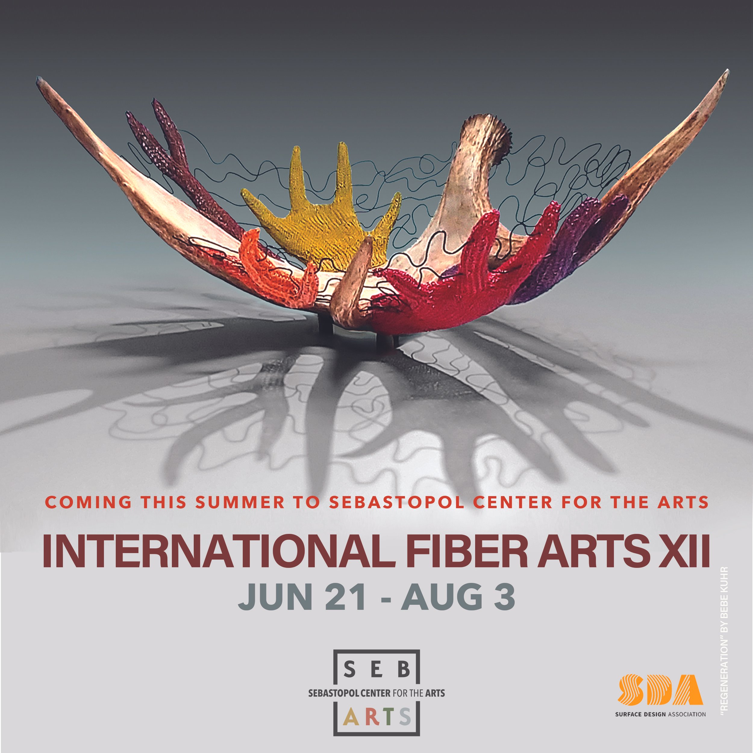
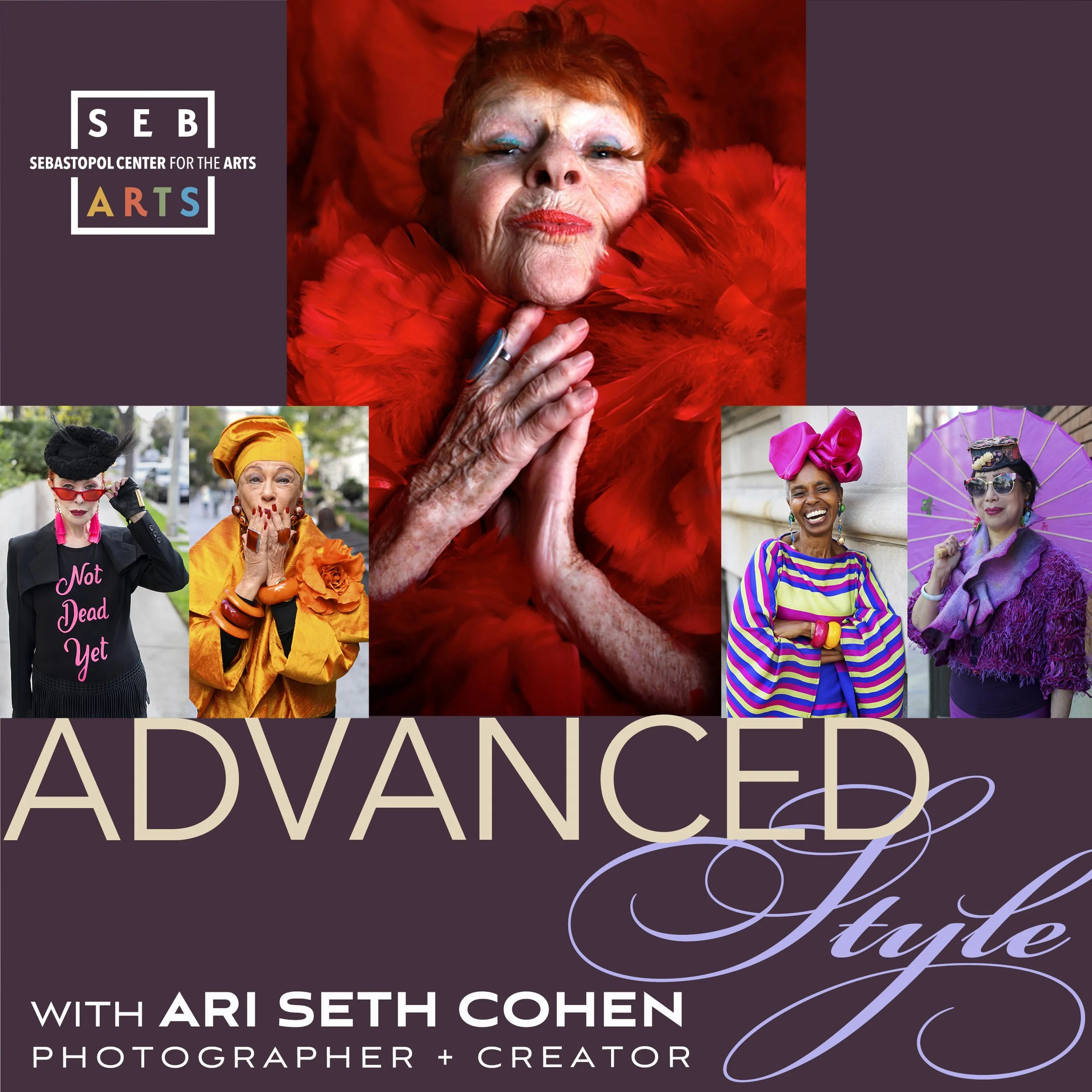
Across SebArts’ exhibition program, I developed the visual design, catalogs, campaign language, environmental graphics, signage, print and digital communications, press materials, and visitor-facing experience.
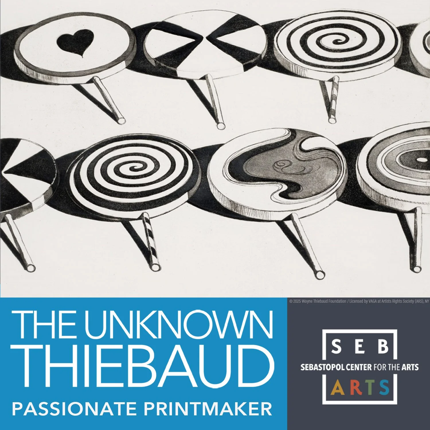
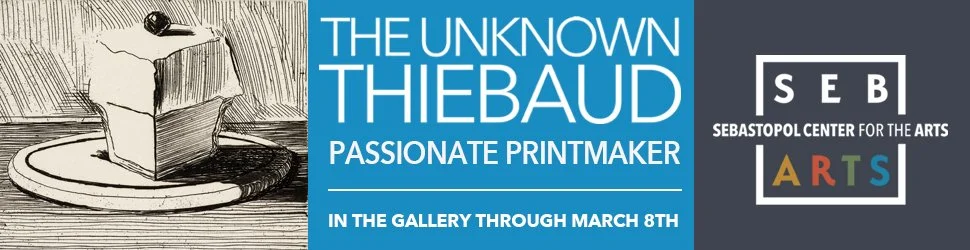
Other major exhibitions included The Unknown Thiebaud — Passionate Printmaker, The Belonging Project, The International Fiber Show, Illuminations, and a full calendar of member and juried exhibitions.
The goal was consistent throughout: give each exhibition its own character while keeping the experience unmistakably SebArts.
fundraising >
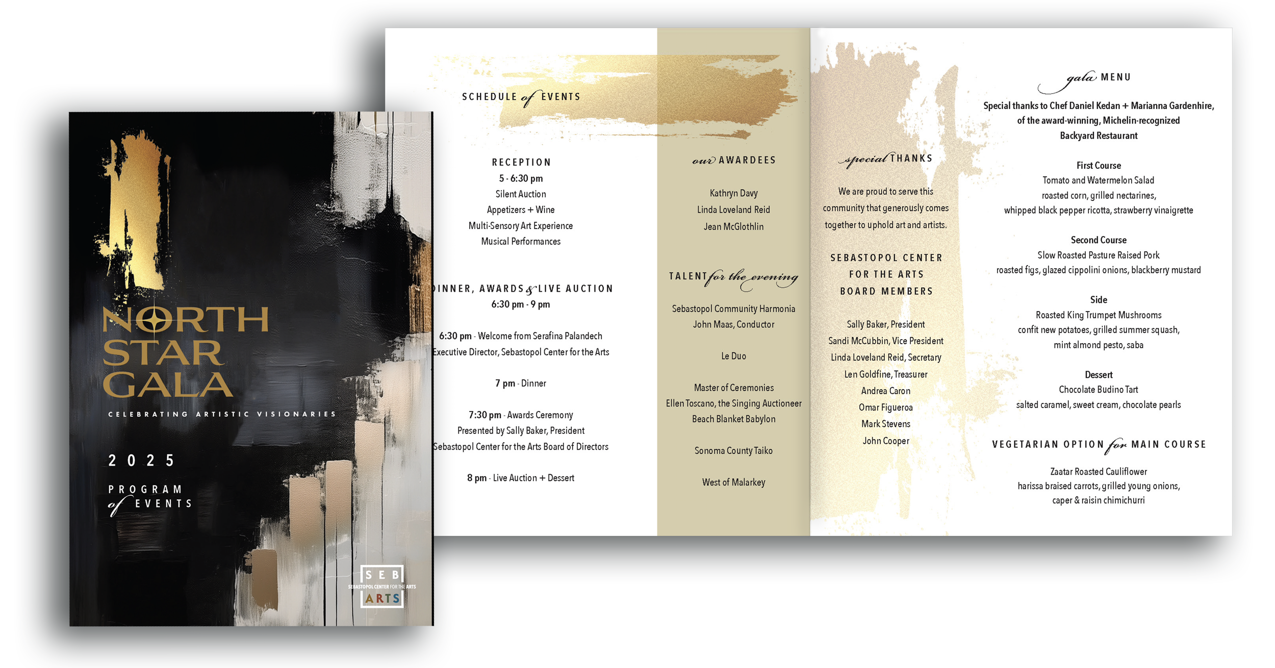
North Star Gala
I established the visual and marketing platform for the North Star Gala as an annual fundraising platform, leading its brand strategy, identity, creative direction, environmental design, marketing, communications, and sponsorship visibility.
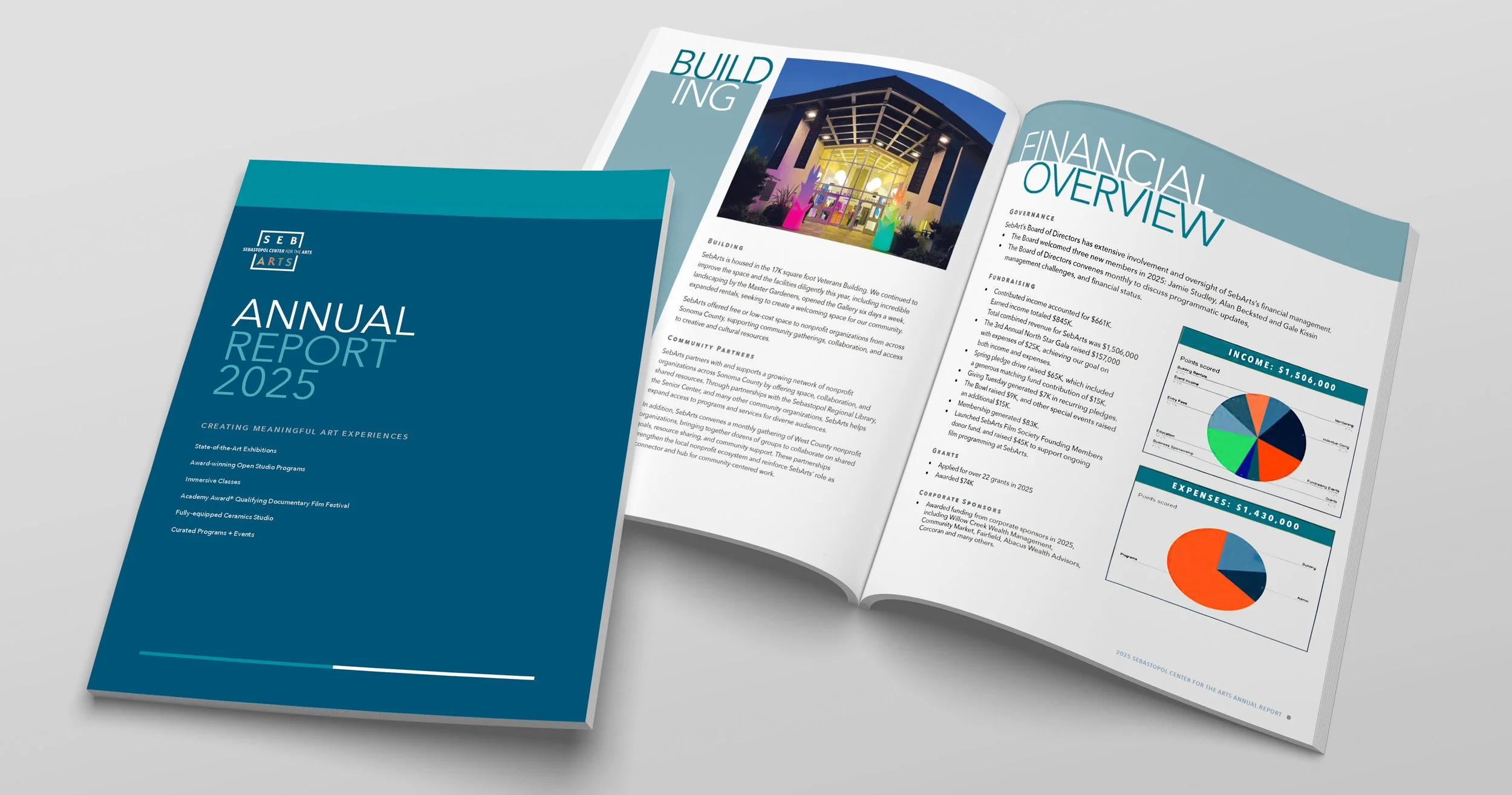
By its third year, the event generated $157,000 in revenue against $25,000 in expenses.

the film festival >
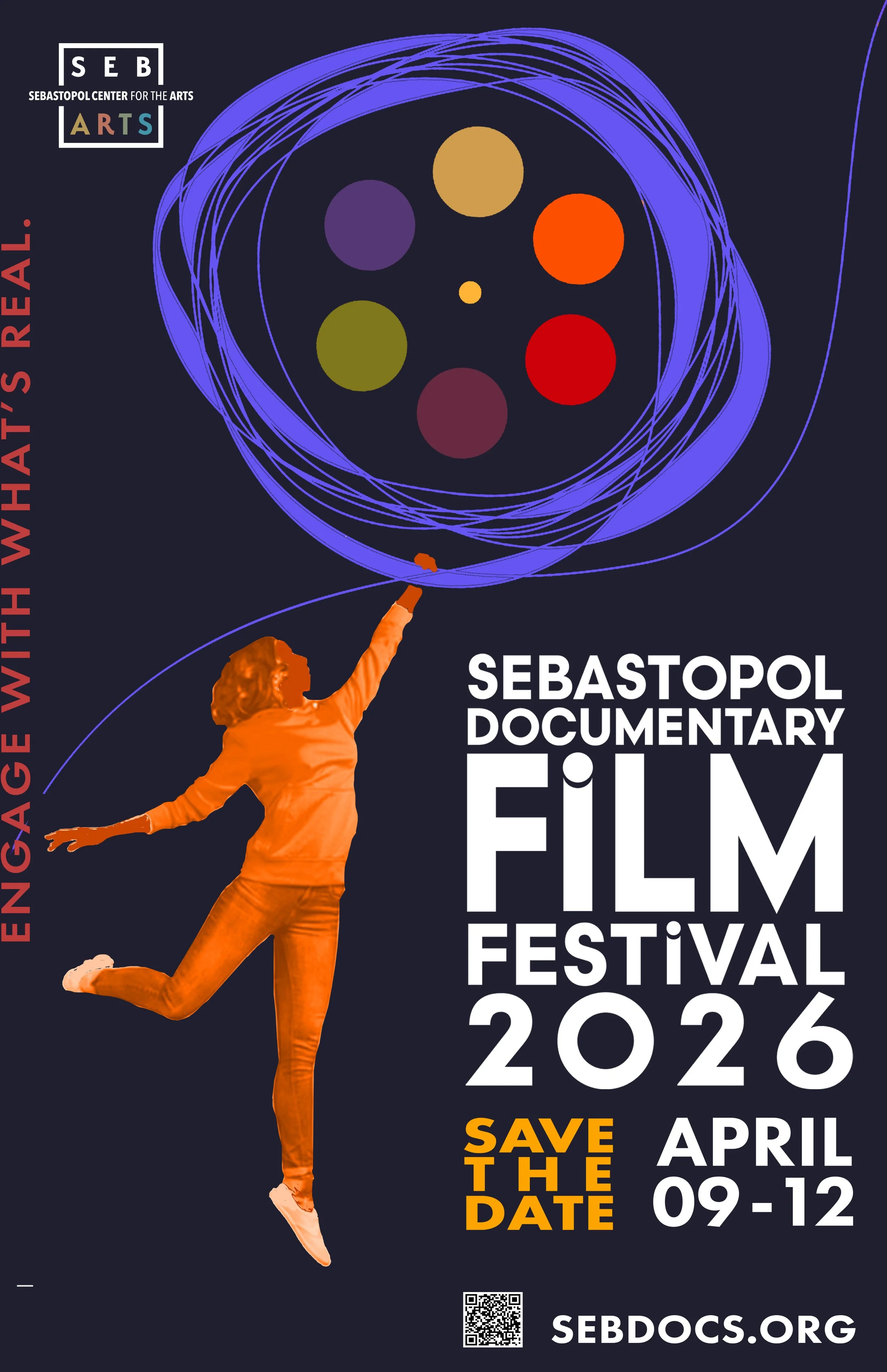
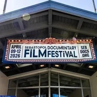
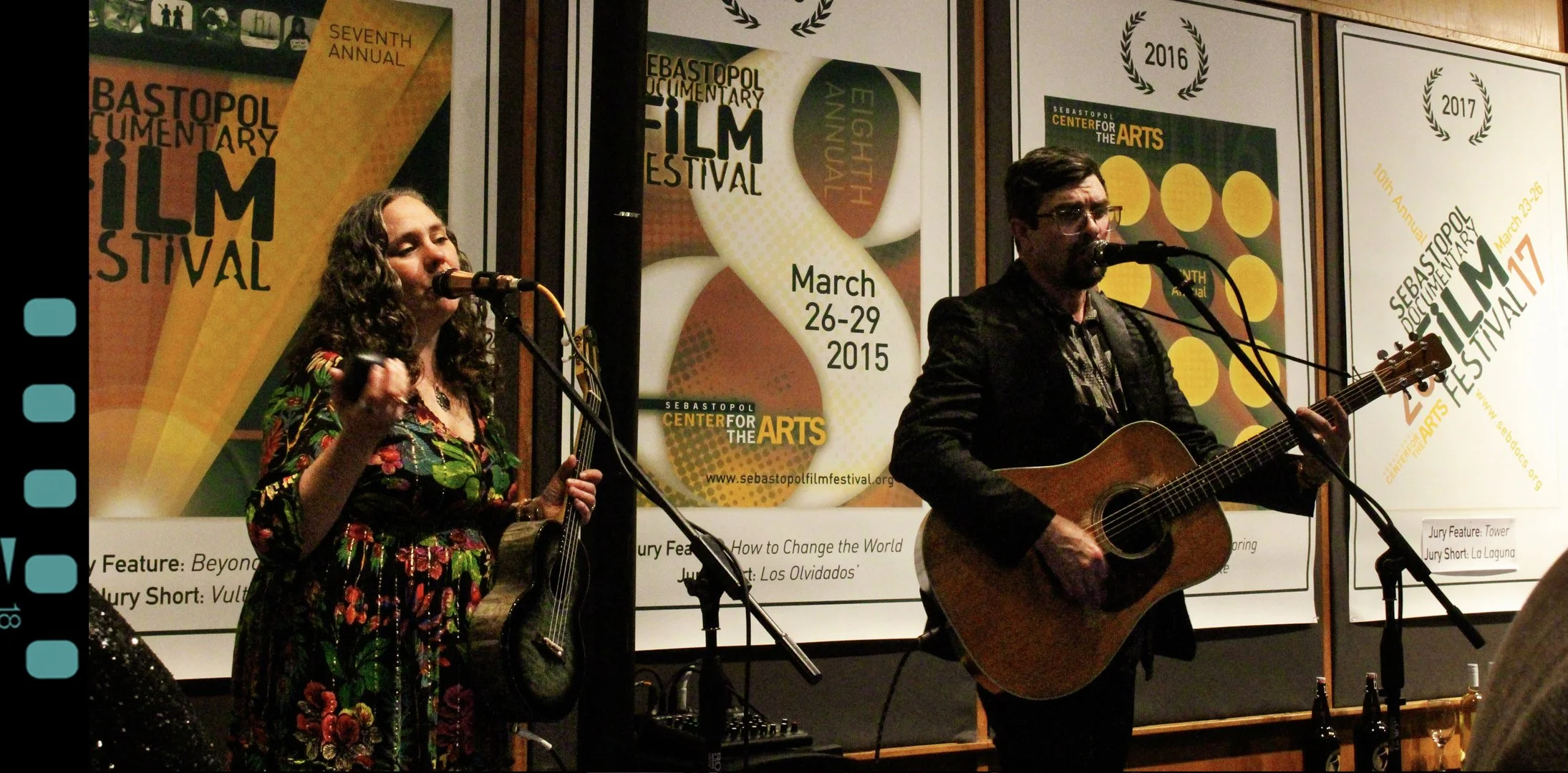
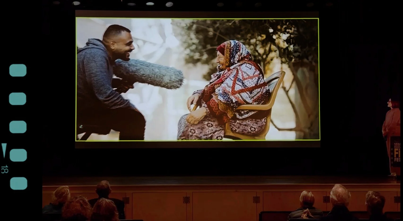
Sebastopol Documentary Film Festival
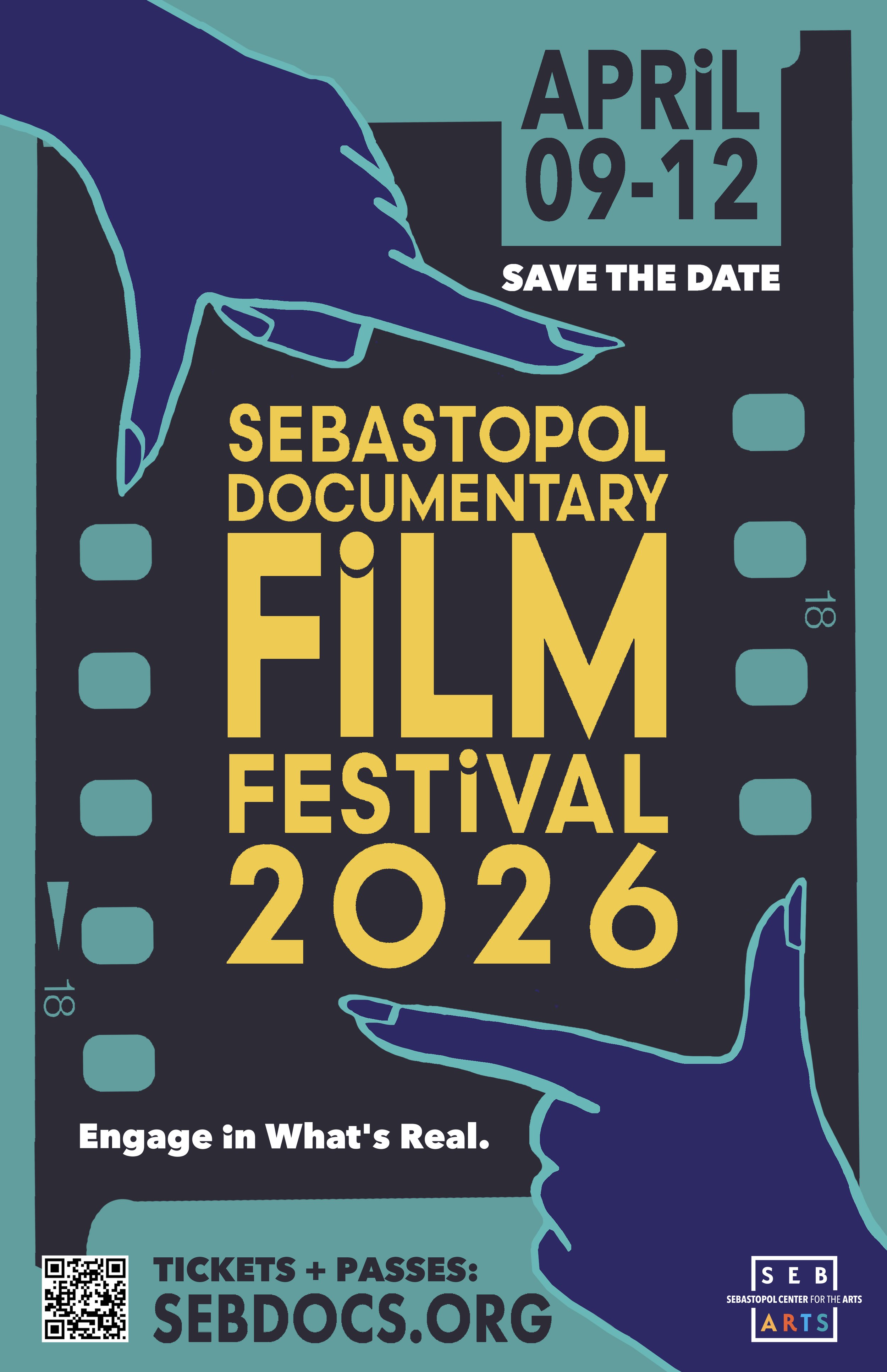
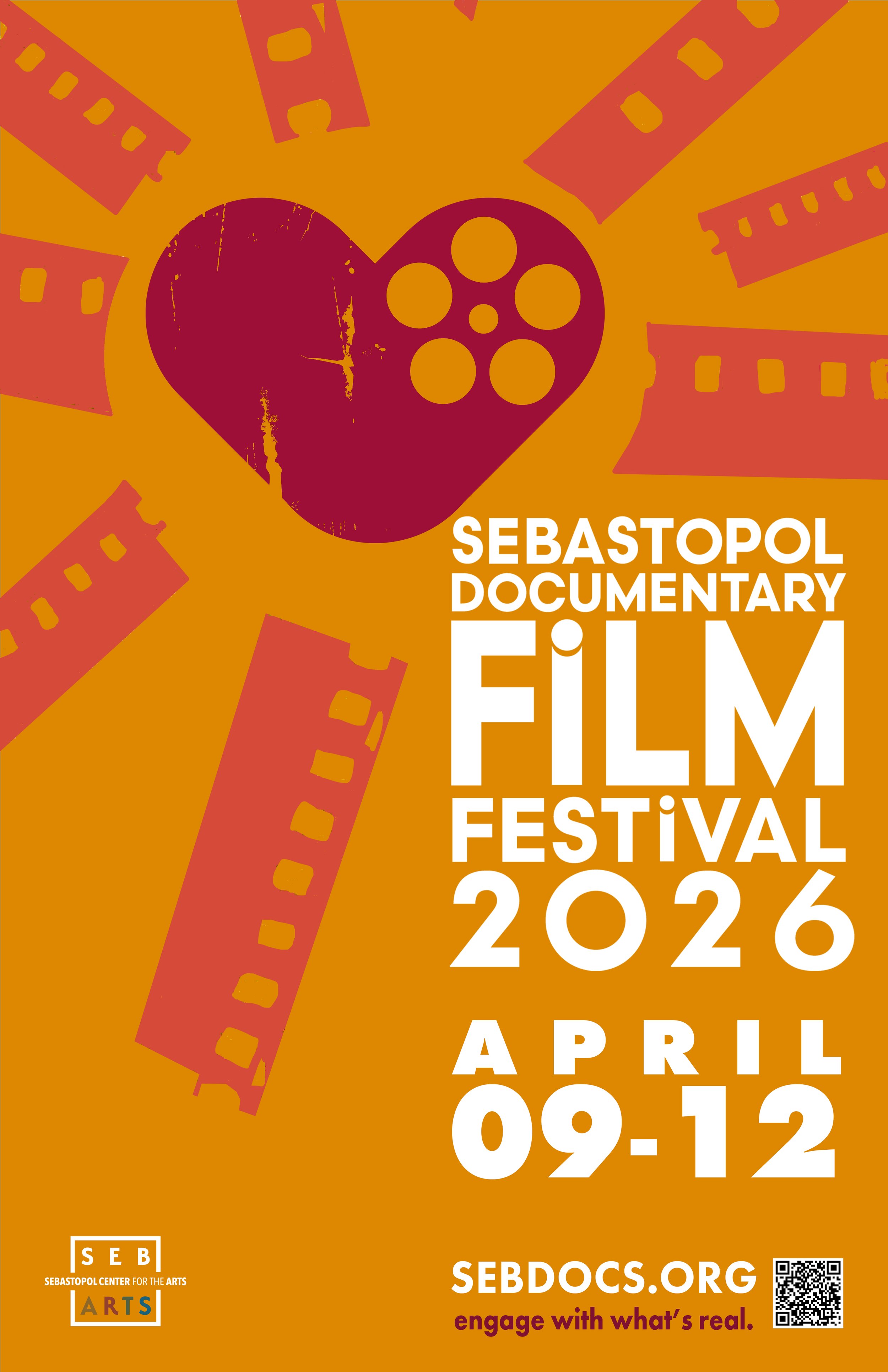
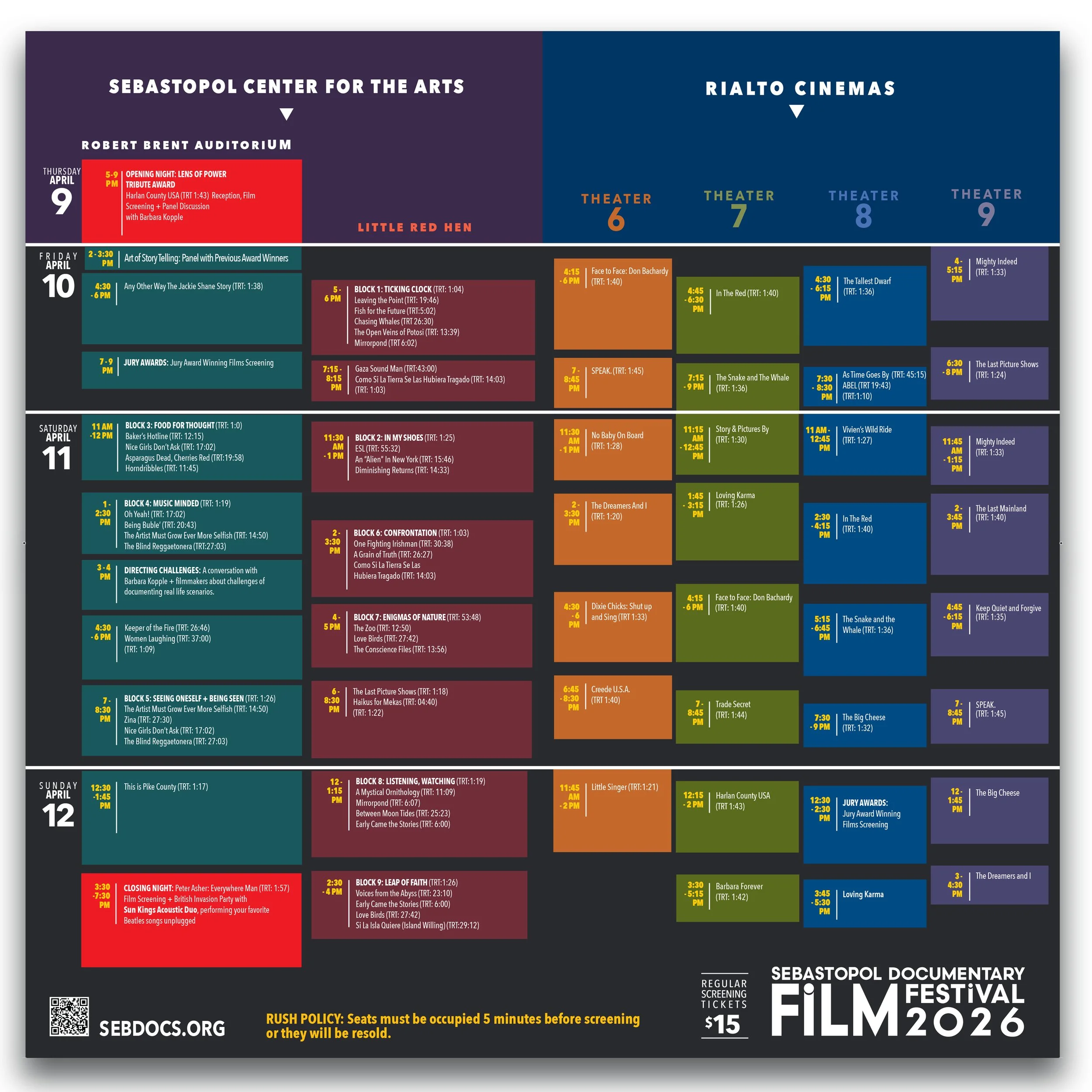
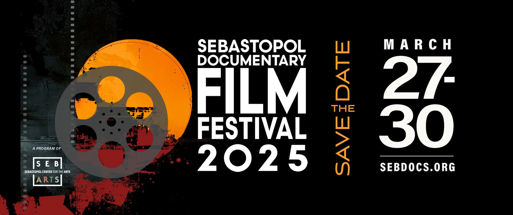
I redesigned the festival identity, website, programs, posters, signage, advertising, trailers, and promotional materials — strengthening its independent presence while staying connected to SebArts.




the festival launch reels >
the 2026 SDFF trailer >
Concepted, art directed, and edited in Adobe Premiere Pro as the festival’s opening trailer, shown before every screening to create a consistent branded experience across the festival.
the open studios >
Spring + Fall Art Tours
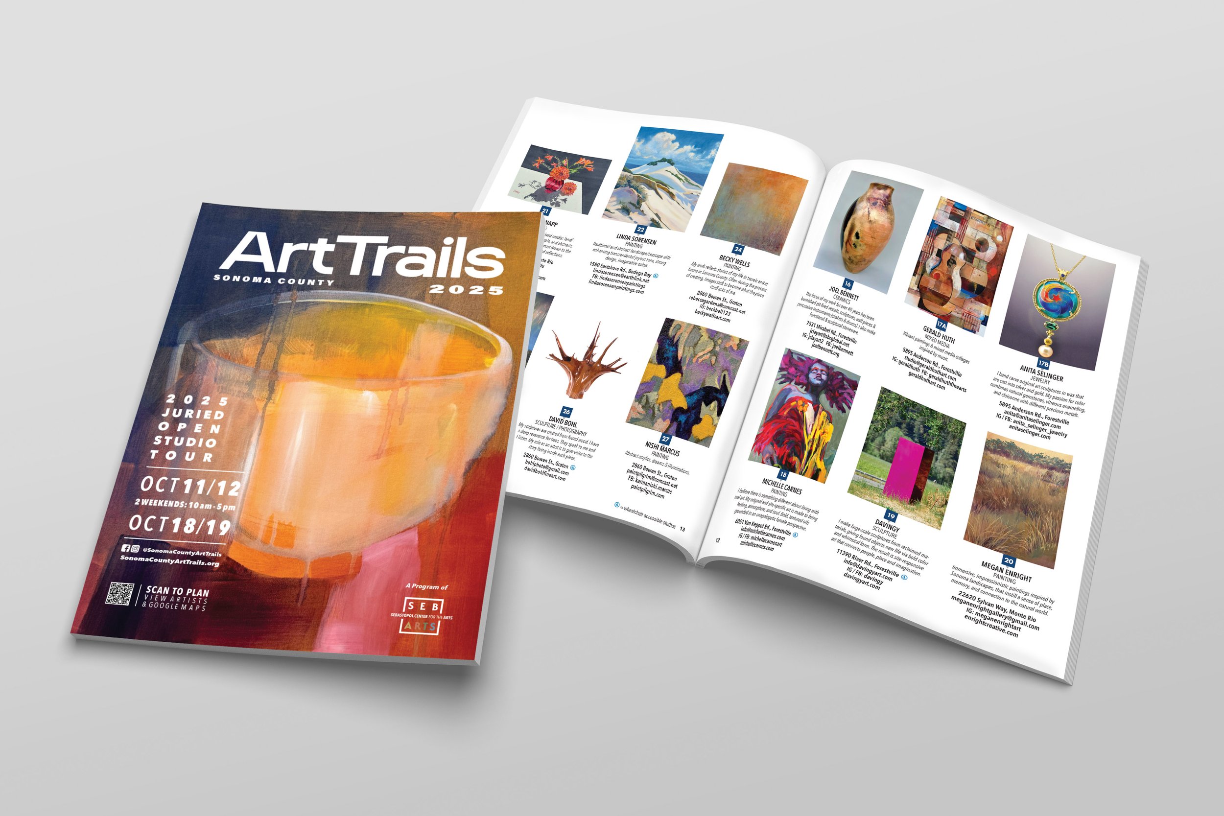
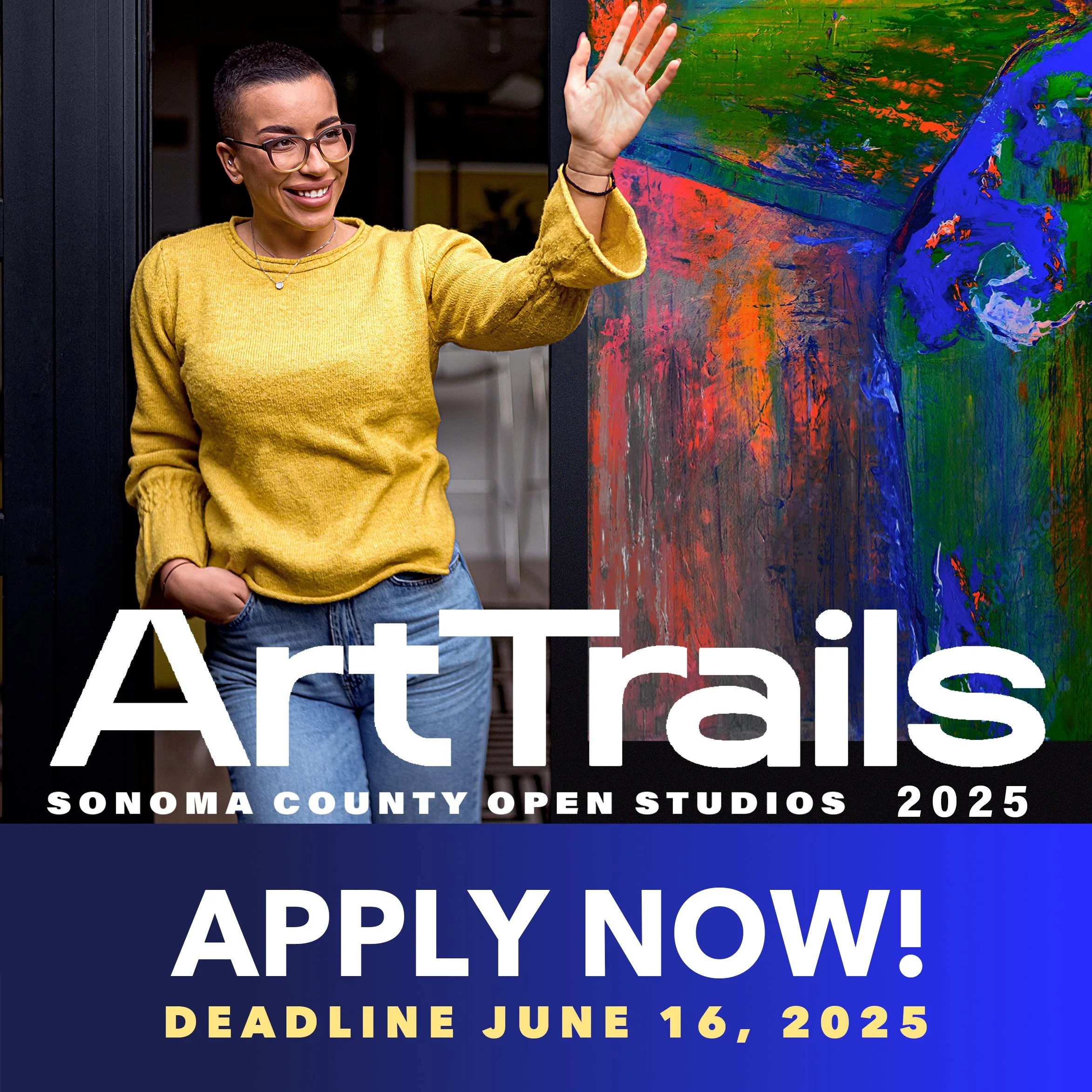
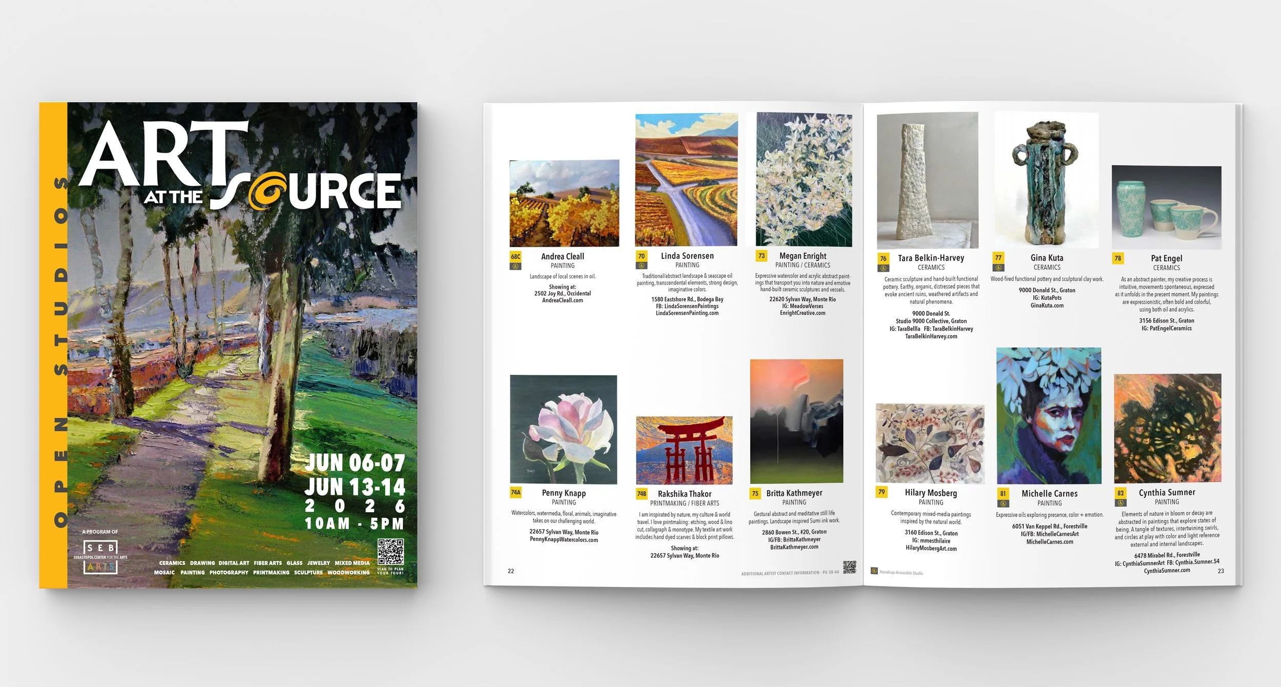
I redesigned the identities, catalogs, websites, advertising, and communications for Art at the Source and Art Trails open studio shows, while also serving on the steering committee and helping improve program processes and standards.

the interior + exterior >
Environmental Design
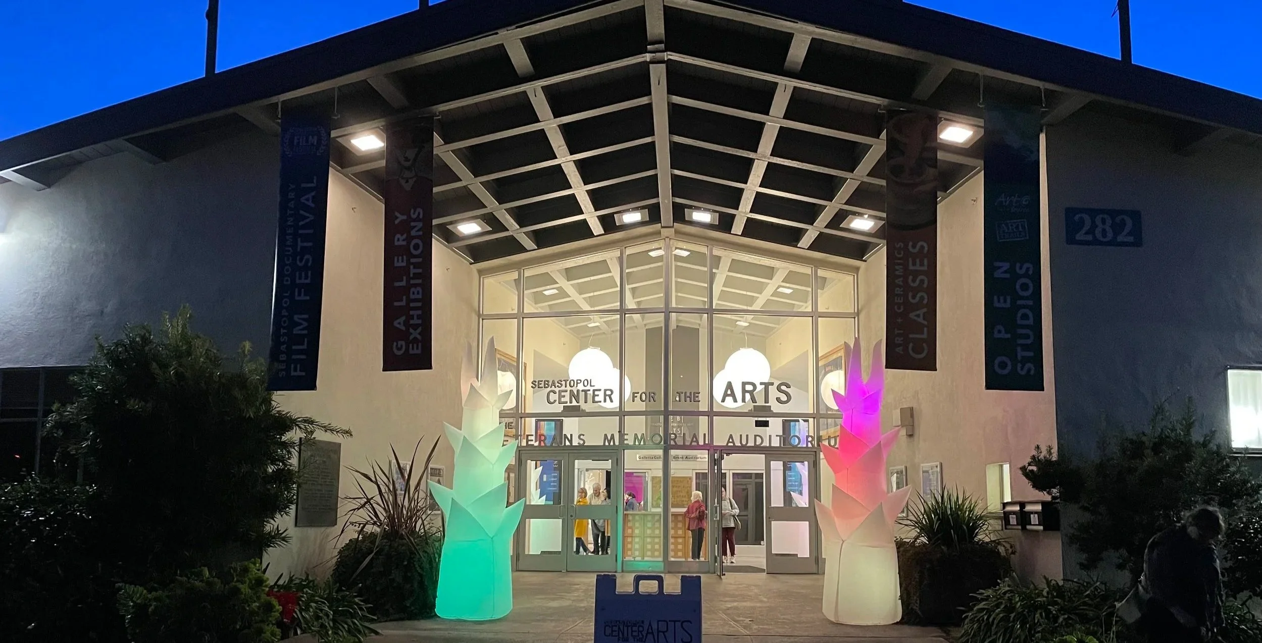
SebArts operates inside a shared Veterans Building, but the public-facing environment didn’t immediately communicate that visitors were entering a contemporary arts organization.
I led the visual refresh across color choice, signage, graphics, donor recognition, and exterior brand applications, navigating stakeholder review and approval within the shared facility.
The objective was simple: make arrival feel like SebArts.
< the impact
$1.5M
Annual organizational revenue by 2025
$1M+
Artist sales generated through Open Studios
39,000+
Open Studio visitors in 2025
1,000+
Members
$157K
Third Annual North Star Gala revenue against $25K in expenses
From uncertainty to visible momentum
The turnaround was the work of the entire organization — executive leadership, staff, board members, artists, volunteers, donors, and community partners.
My role was to give that transformation a coherent public identity and build the creative, marketing, and experiential systems that supported its growth.
the reflection >
A strong identity doesn’t simply tell people who an organization is. It gives them a world they can recognize, enter, and belong to.
This project reinforced something central to how I think about creative leadership:
A brand is the accumulation of every experience people have with an organization.
The building they enter.
The website they visit.
The exhibition they remember.
The catalog they carry.
The story they read.
The event that brings them back.
My role was to connect those experiences so they felt like parts of the same cultural world, because Art and community matter.
case studies
-
![]()
Sebastopol Center for the Arts
-
![]()
Red Touch Media
-
![]()
Qdoba Mexican Eats
-
![]()
City of Wheat Ridge