

2012 -2016
the assignment >
10,000 SQ. FT. ORIGINAL HEADQUARTERS
+5,000 SQ. FT. EXPANSION
LONDON OFFICE
CES
SUNDANCE
SXSW
Building a Brand World That Could Travel
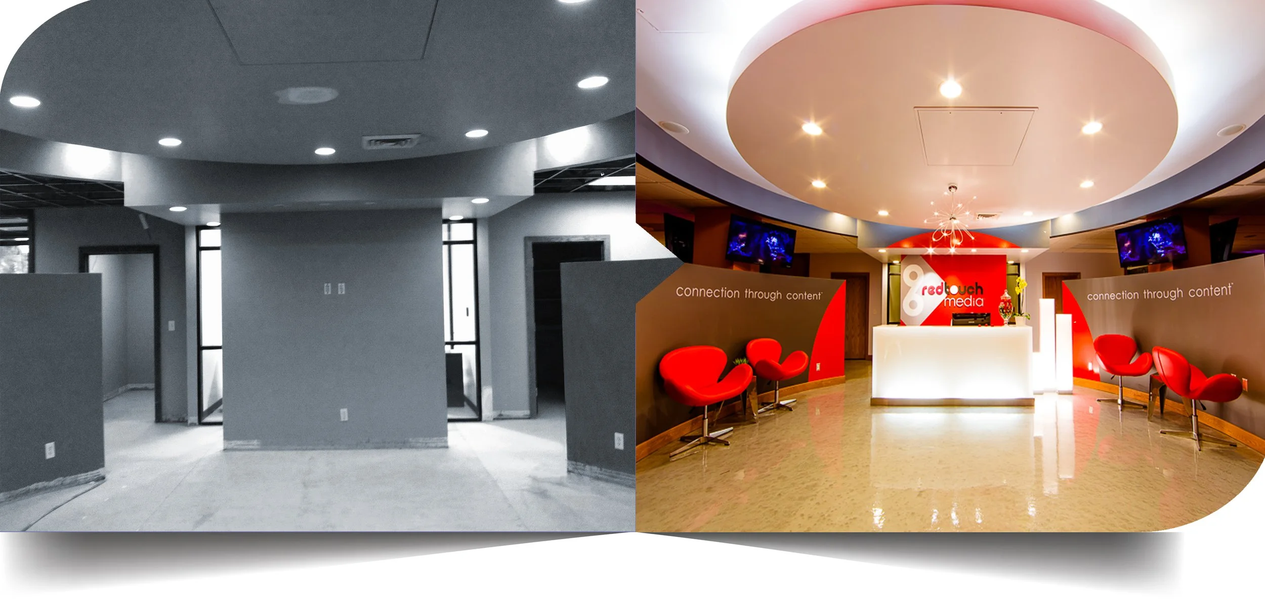
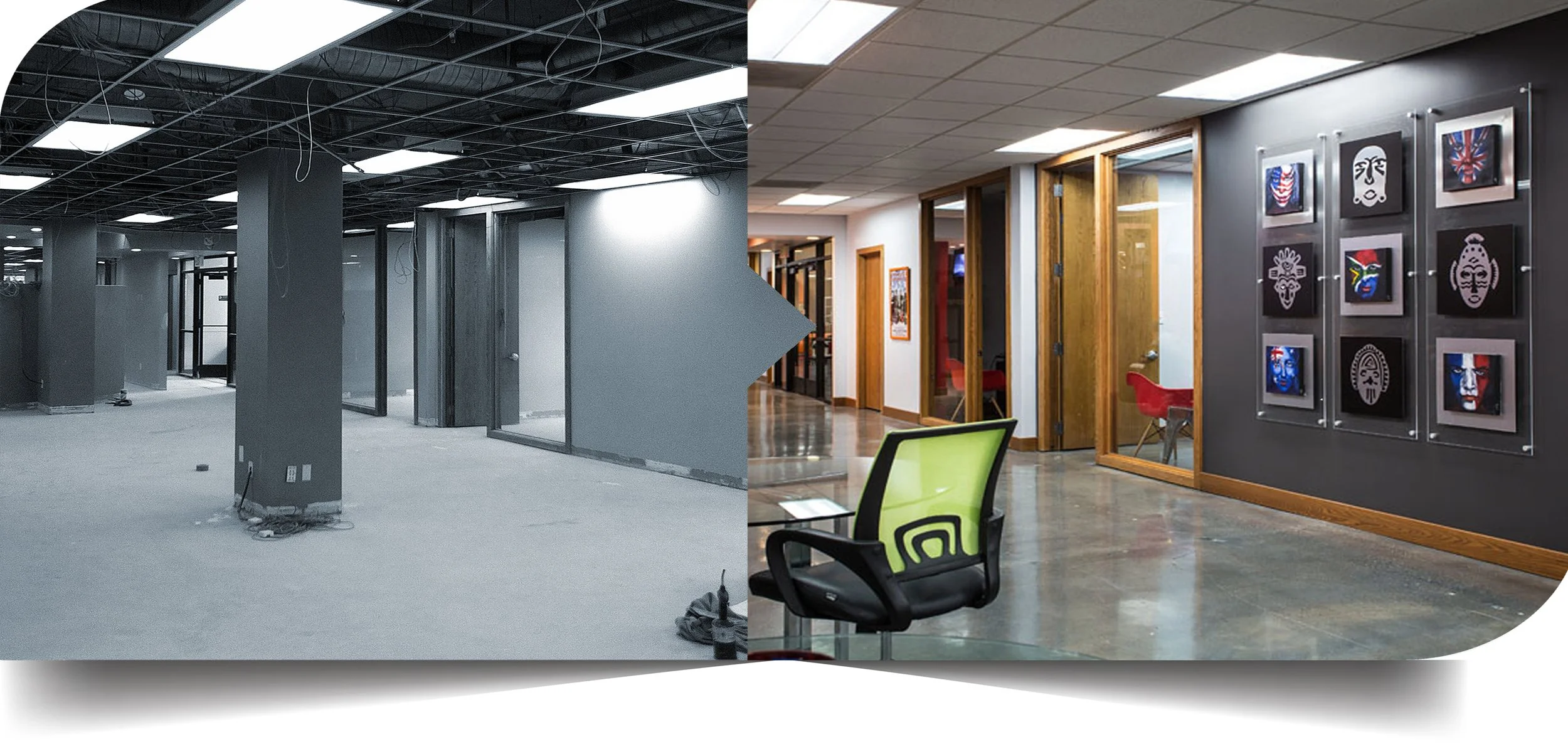
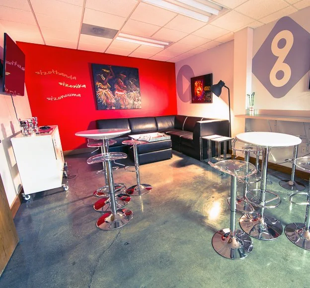
In 2012, Red Touch Media needed to transform a new 10,000-square-foot Salt Lake City headquarters from raw construction into a workplace that felt unmistakably its own — on a compressed timeline with a company launch already on the calendar.
Working directly with founder and CEO Wayne Scholes and Chief Creative Officer Davy Alder, I led the environmental creative direction — translating a fast-moving digital technology brand into a physical experience through art, graphics, color, objects, and atmosphere.
The visual language also needed to be flexible enough to travel, extending beyond the headquarters into trade shows, product launches, and cultural events.
“The goal wasn't to decorate an office. It was to turn the brand into a world people could live in — wherever it went.”
the creative challenge >
Giving a Digital Tech Company a Human Touch
Red Touch Media was a fast-growing digital media technology company operating at the intersection of content distribution, entertainment, film, and music — serving millions of consumers and working with major global entertainment brands.
Its business was highly technical and digital, but its internal culture was anything but corporate. Music, Liverpool football, British and South African culture, vintage entertainment, humor, and the energy of a young creative staff were all part of its identity.
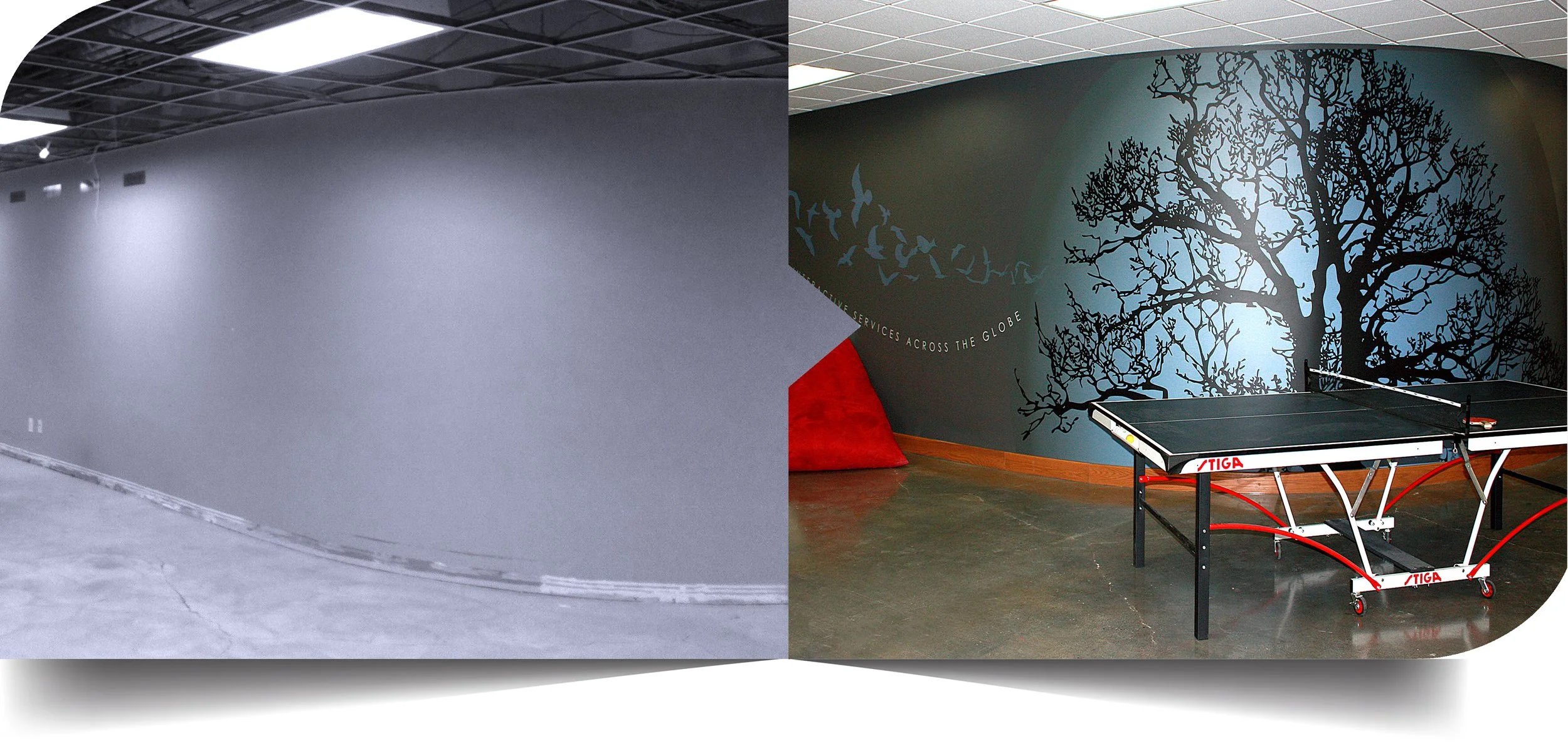
The challenge was to translate that contrast — a sophisticated digital platform with a highly human, creative culture— into a physical environment, starting with little more than concrete, drywall, and new construction.
How do you give a brand history + personality when the space is raw?
< the exploration
What would the team collect?
What would end up on the walls over time?
What would make its people laugh?
What would make employees feel, “this is our place”?
Designing the space as though the brand already lived there
Instead of asking what a tech office should look like, I asked what Red Touch Media would naturally surround itself with.
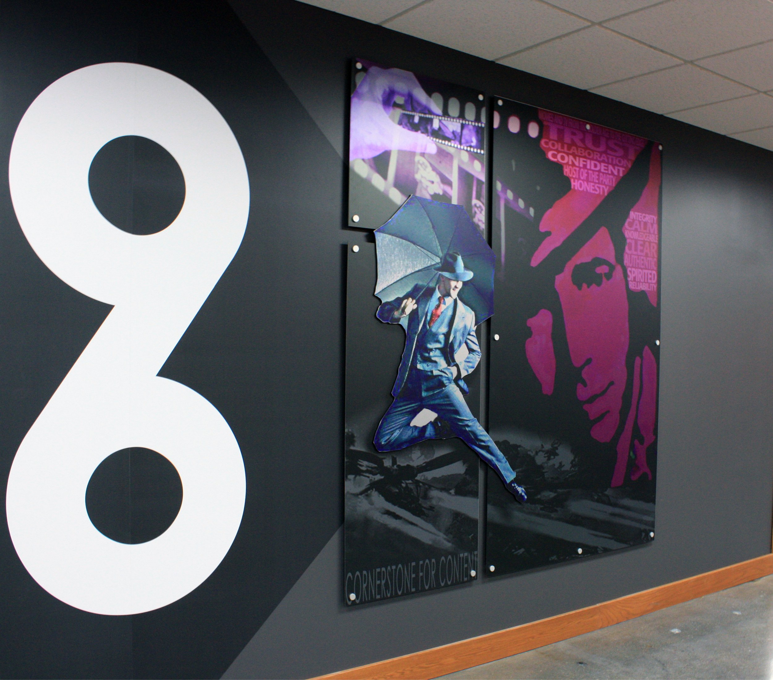
That led me toward a layered visual language — original art, oversized graphics, typography, handmade objects, vinyl, color, and cultural references arranged to feel accumulated rather than coordinated.
The goal wasn’t visual consistency for its own sake. It was to create enough texture, contradiction, and personality that the environment felt like it already belonged to Red Touch.
That thinking became the creative filter for every decision, allowing technology, art, music, humor, and cultural references to coexist without feeling themed or forced.
Red Touch later described its workplace culture as “funky, collaborative and fun-spirited.” That was exactly the kind of environment I had set out to create.
the solution >
Build the Identity Through Art, Objects, Graphics + Atmosphere
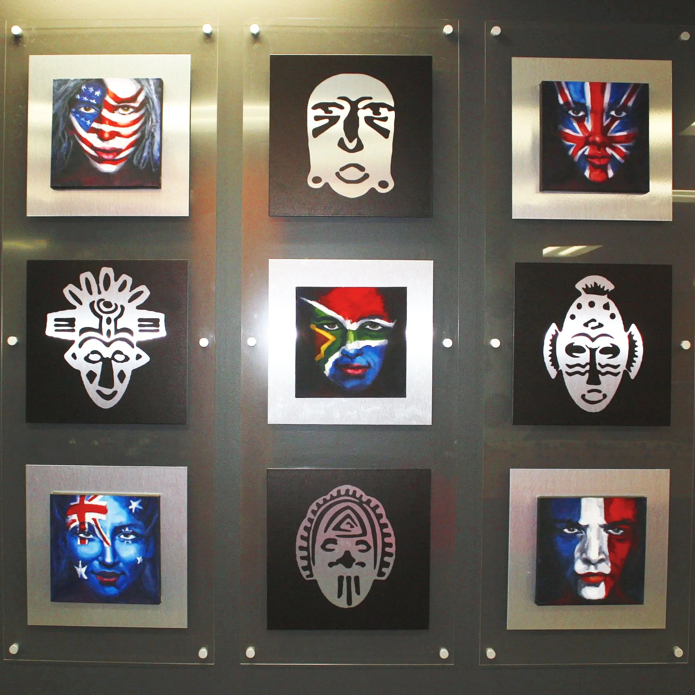
Original art was part of the concept from the beginning — not something added later to fill empty walls.
I built the environmental identity through graphics, paintings, objects, typography, color, custom wall treatments, and unexpected interventions, creating a space that felt collected over time rather than newly decorated.
The strongest test of the concept was whether it could leave the headquarters and still feel unmistakably Red Touch Media.
CES
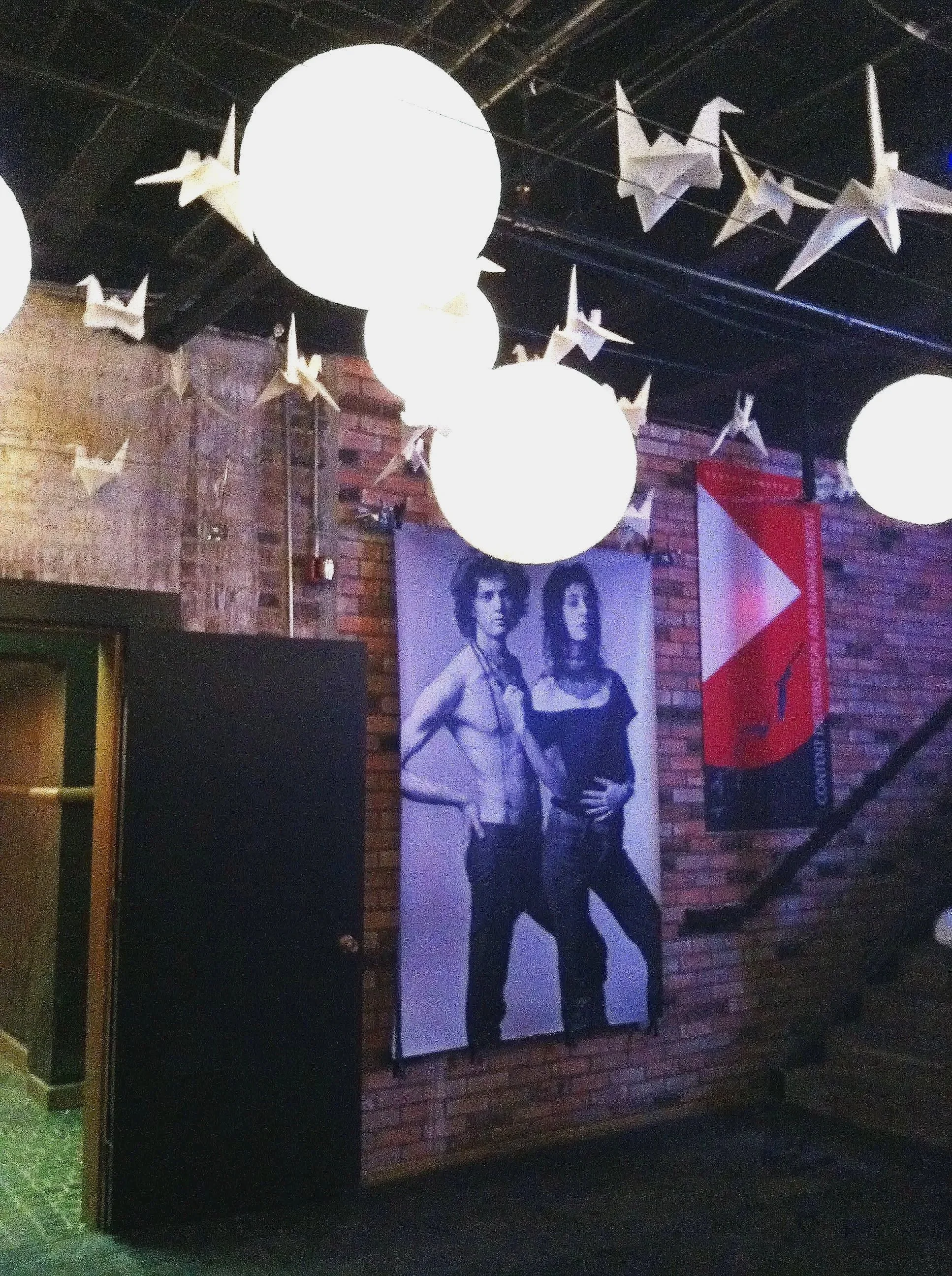
I adapted the environmental graphics for Red Touch Media’s CES brand and product launch, translating the workplace identity into a recognizable trade-show presence.
SUNDANCE + CHEFDANCE
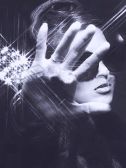
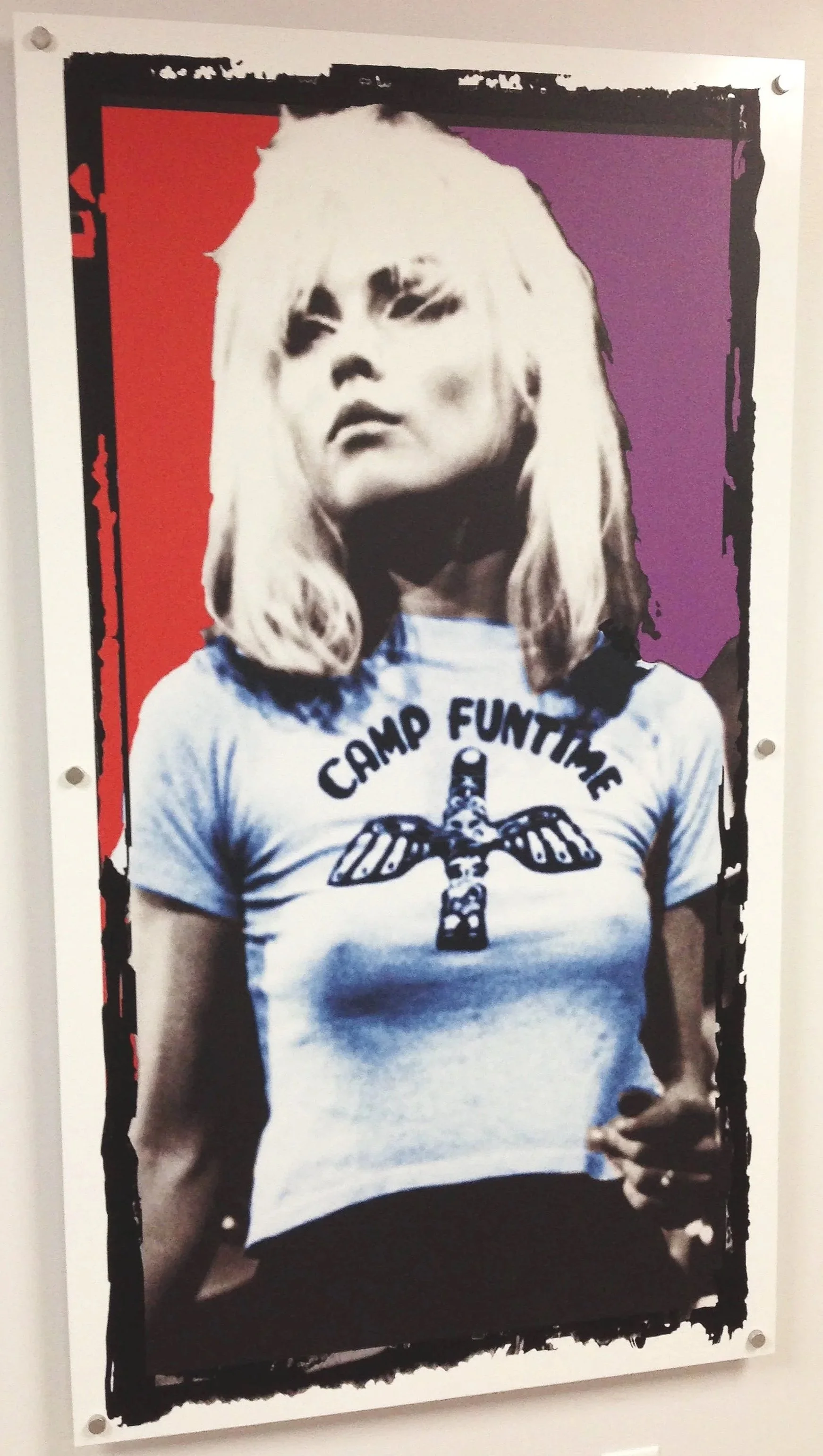
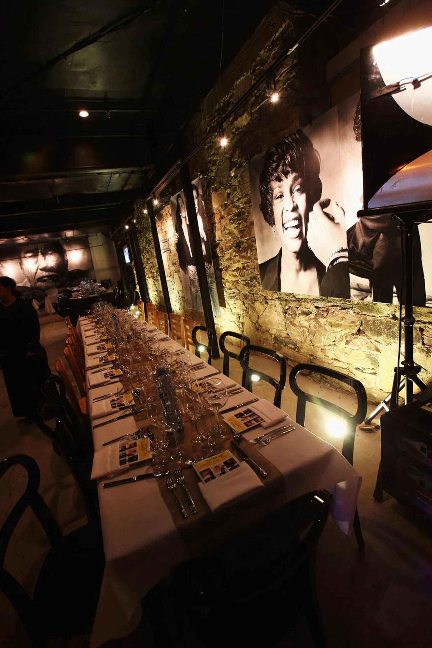
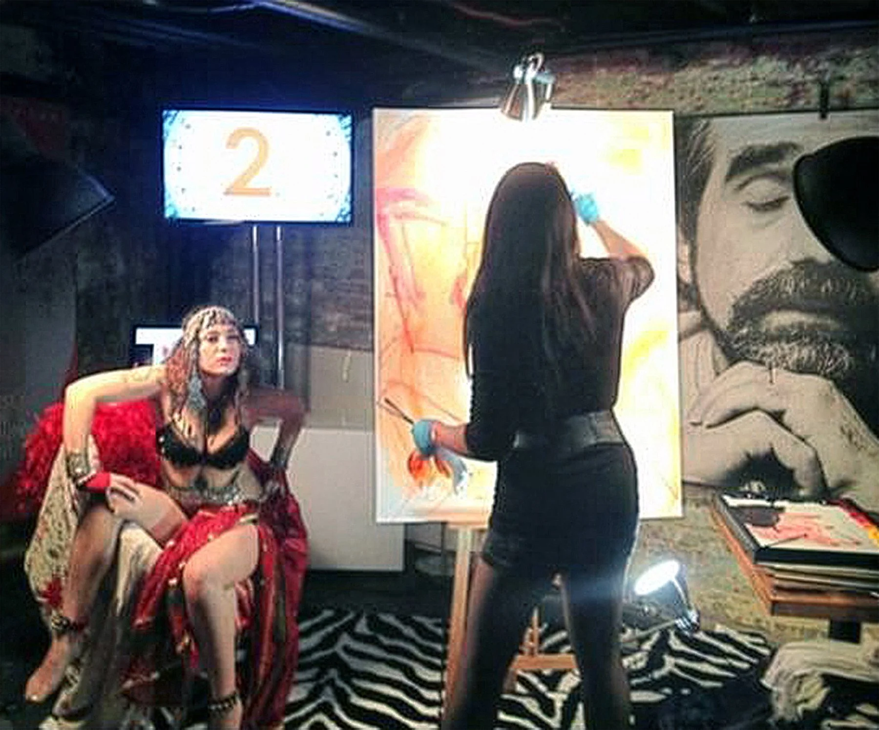
At Sundance, I extended the system into Red Touch Media’s ChefDance and Social Lounge, where my graphics appeared alongside monumental rock photography by Norman Seeff.
I also painted a live model onstage within the environment — intentionally blurring the line between brand, art, music, performance, and experience.
Red Touch later commissioned an original portrait of ChefDance co-founder Mimi Kim, extending the role of art into the company’s culture and relationships.
SXSW + BEYOND
The identity traveled again to South by Southwest, including activations connected to the ASOS Music Lounge and NYLON Magazine’s Terrace at the W.
The visual language also extended into advertising, collateral, and promotional work connected to events including the Daytime Emmy Awards.
Sundance | Chefdance
What began as a workplace identity became a flexible brand experience — one that could move from office to trade show, festival, and live cultural event without losing its character.
< the outcome
An environment that became a platform.
What started as an office identity became a flexible experiential system that could move from workplace to trade show, film festival, music event, and live performance without losing its character.
The headquarters opened on schedule and became a physical expression of Red Touch Media’s culture. More importantly, the company kept investing in the idea.
The strongest measure of success was simple: they didn’t just use the environment — they asked me to keep building the world around the brand.
THE IDEA KEPT GROWING
I was brought back to:
Extend the identity into an additional 5,000-square-foot headquarters expansion
Create art for Red Touch Media’s London office
Adapt the system for CES, Sundance, ChefDance, and SXSW
Continue developing art, graphics, and promotional work for the brand
from the founder >
“Michelle has provided us with something so valuable to us as a team. We look at the work every day and we are reminded of where we came from, who we are, and what we can achieve together. It is everything that we had hoped we would get.The works have become a centerpiece for our offices, our personalities are right there for all to see and we love it! Working with Michelle was so easy, it felt so effortless to get our thoughts out, the best bit is seeing those thoughts translated into art that we all identify with so easily. Inspiring work and a pleasure to collaborate with.”
— Wayne Scholes, Founder, Red Touch Media
< the reflection
Brand guidelines tell you how a brand should look. A strong brand world shows you how it lives.
Red Touch Media worked because the environment wasn’t built around a decorating theme. It was built around the company’s ethos, culture, and point of view.
That gave the identity enough depth and flexibility to feel authentic in very different settings — from the Salt Lake City headquarters and London office to CES, Sundance, and SXSW.
That principle still shapes how I approach experiential branding:
Find what is already true about the brand — then make it tangible enough for people to enter, experience, and remember.
case studies
-
![]()
Sebastopol Center for the Arts
-
![]()
Red Touch Media
-
![]()
Qdoba Mexican Eats
-
![]()
City of Wheat Ridge